Visit website
GreenLock
26 views3mo ago
Concept
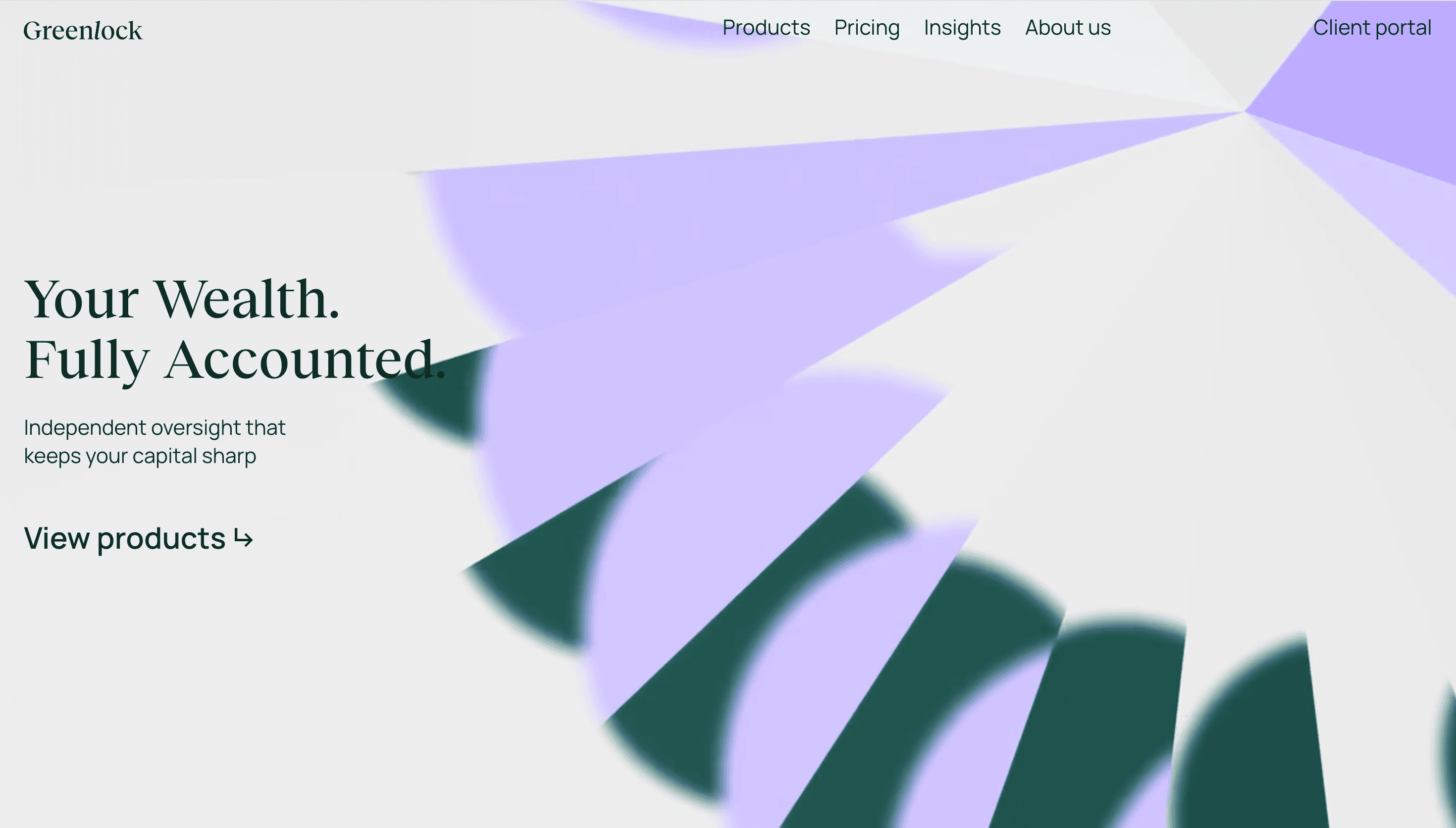
GreenLock positions itself as an independent oversight partner for family offices, emphasizing governance, fiduciary care, and long-term stewardship of wealth. The messaging centers on trust and impartial oversight rather than product-led features. This focus targets family principals and advisors who require clarity, accountability, and continuity in wealth management.
Visual Language & Motion
The visual language is expected to be restrained and professional, using typographic clarity and a measured color palette to convey stability. Any motion or interaction would likely be subtle and purposeful, employed to reinforce hierarchy and guide attention without distracting from core information. Overall, visuals support credibility and a conservative brand posture appropriate for fiduciary services.
UX & Performance
UX priorities for an oversight service are clarity, easy access to governance information, and streamlined contact or onboarding paths for families and advisors. Performance and security are implied necessities, ensuring fast, reliable access to sensitive information and confidence in the platform. Content architecture should present services, principles, and credentials up front to aid decision-making.
Takeaway
GreenLock frames itself as a specialized, trust-first provider for family office oversight, where clear governance and impartial oversight are central selling points. The site should reinforce professionalism through restrained design, straightforward UX, and messaging that speaks directly to long-term stewardship and accountability.