Visit website
Studio 12
12 views3mo ago
Concept
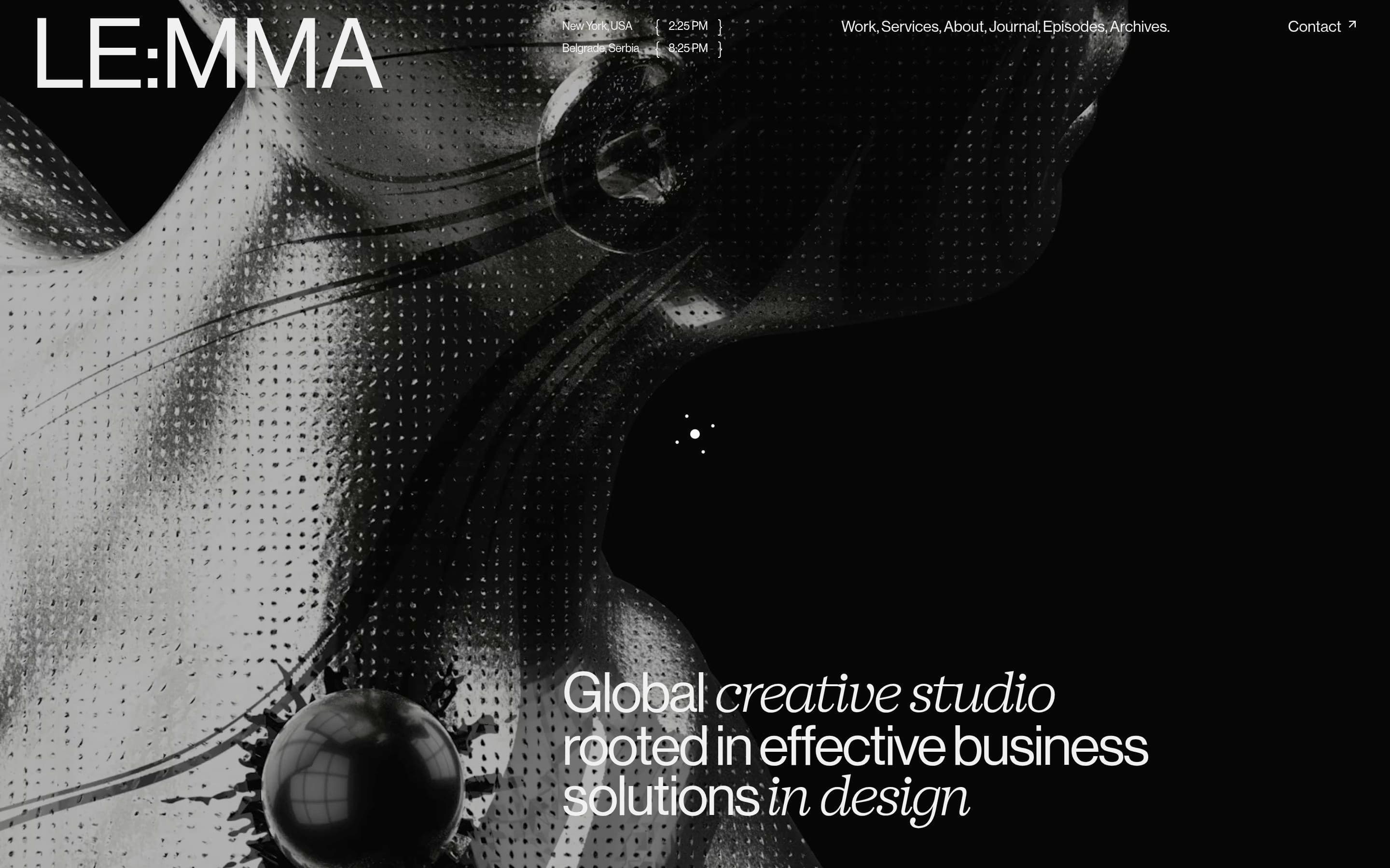
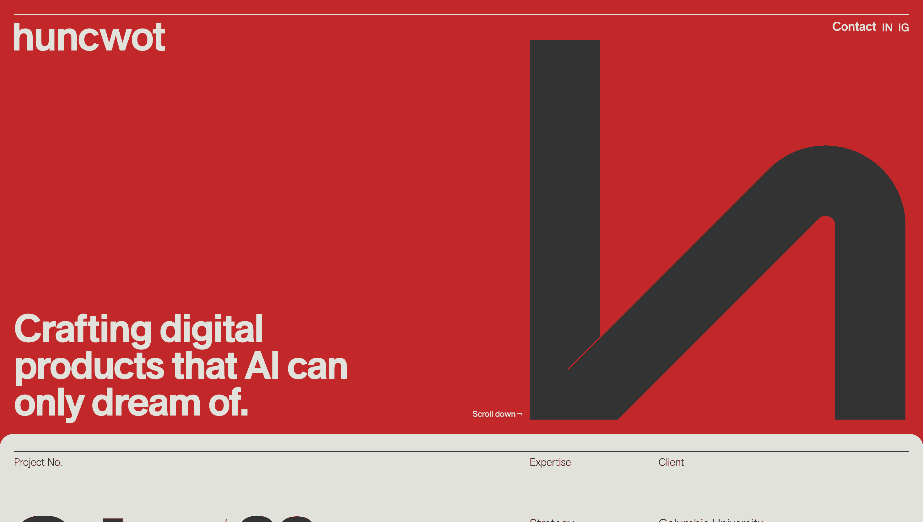
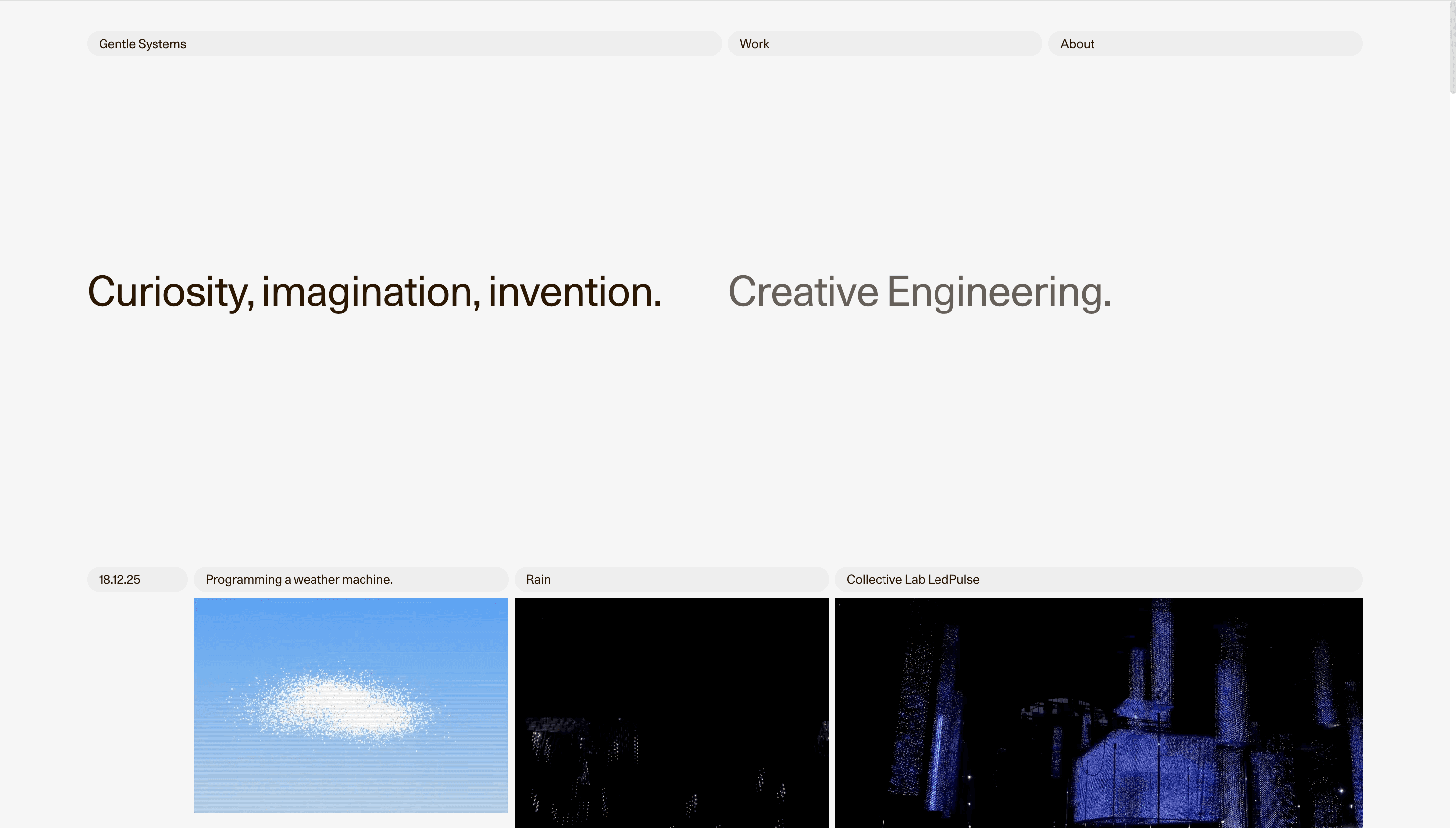
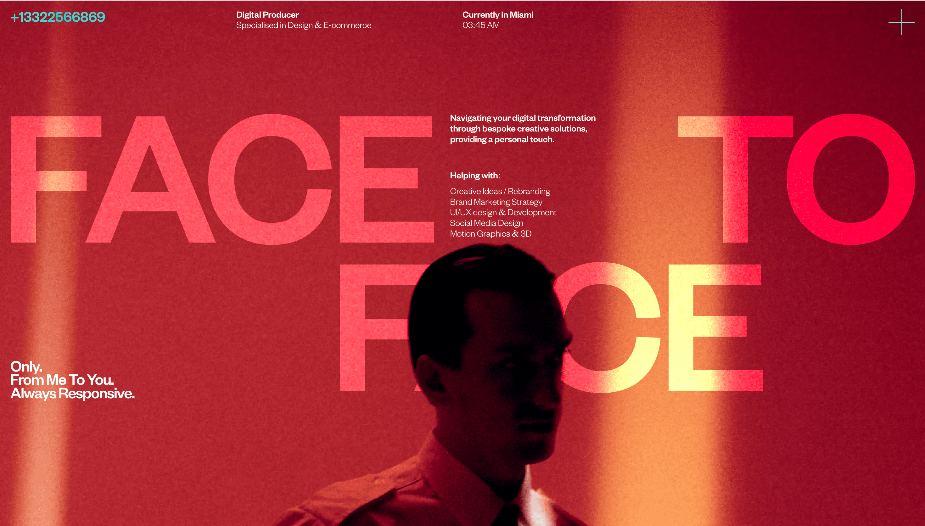
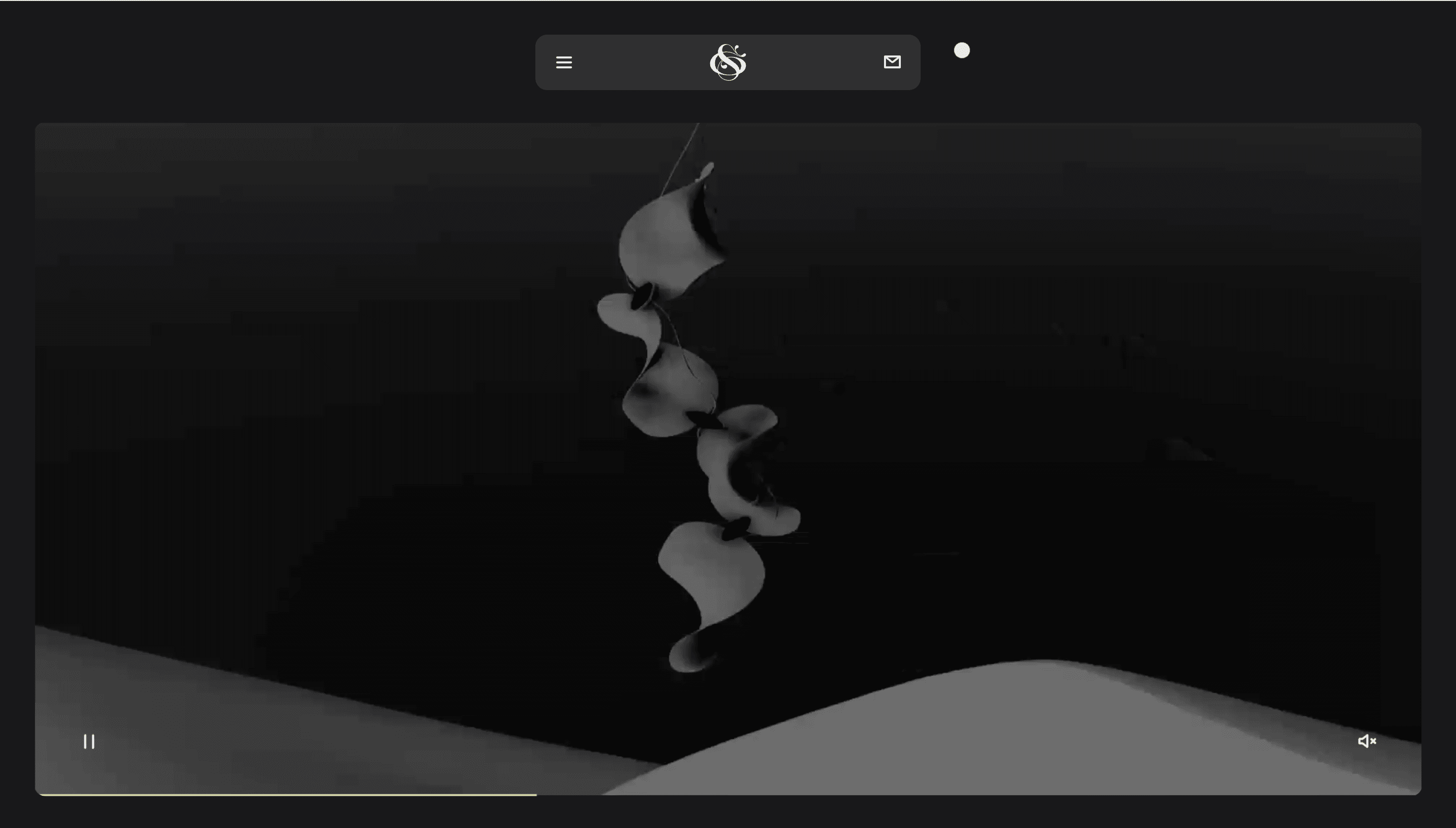
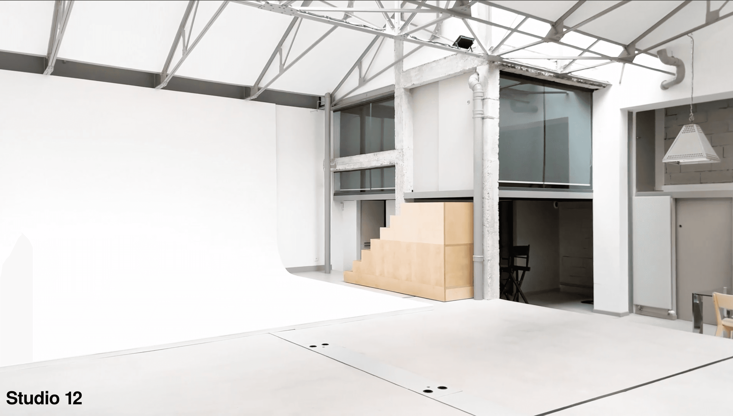
Studio 12 presents their work through an architectural metaphor, organizing projects in a virtual space that users navigate via floor plan. This spatial approach creates a physical dimension to digital browsing. The implementation maintains simplicity while offering confident exploration of their portfolio.
Visual Language & Motion
The clean aesthetic uses generous white space and minimal visual elements to focus attention on projects. Subtle interactions occur as users move through the gallery space, with careful attention to transition pacing. Typography and color choices maintain brand consistency without overwhelming content.
UX & Performance
The floor plan interface provides clear orientation within the portfolio while encouraging discovery. Navigation feels intuitive despite its unconventional approach, with performance optimized for smooth transitions between sections. Spatial relationships help users mentally map the studio's body of work.
Takeaway
Studio 12 successfully translates physical gallery conventions into digital space, creating memorable project exploration. The restrained execution demonstrates how novel navigation patterns can enhance content presentation when balanced with usability considerations.