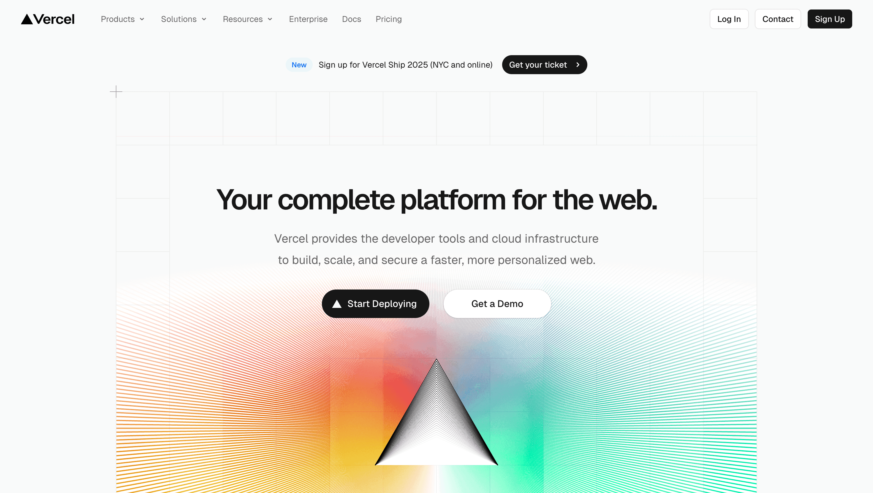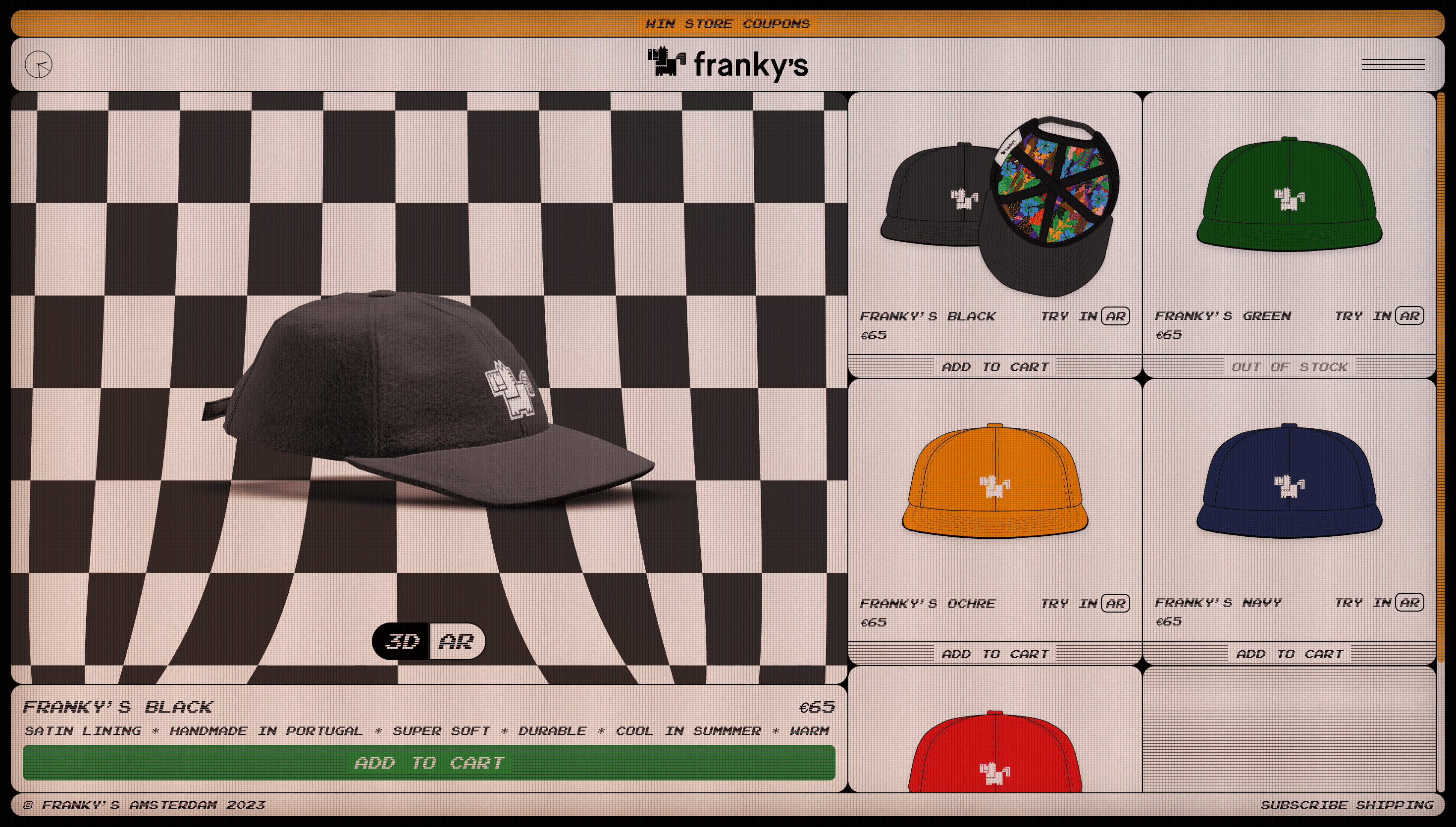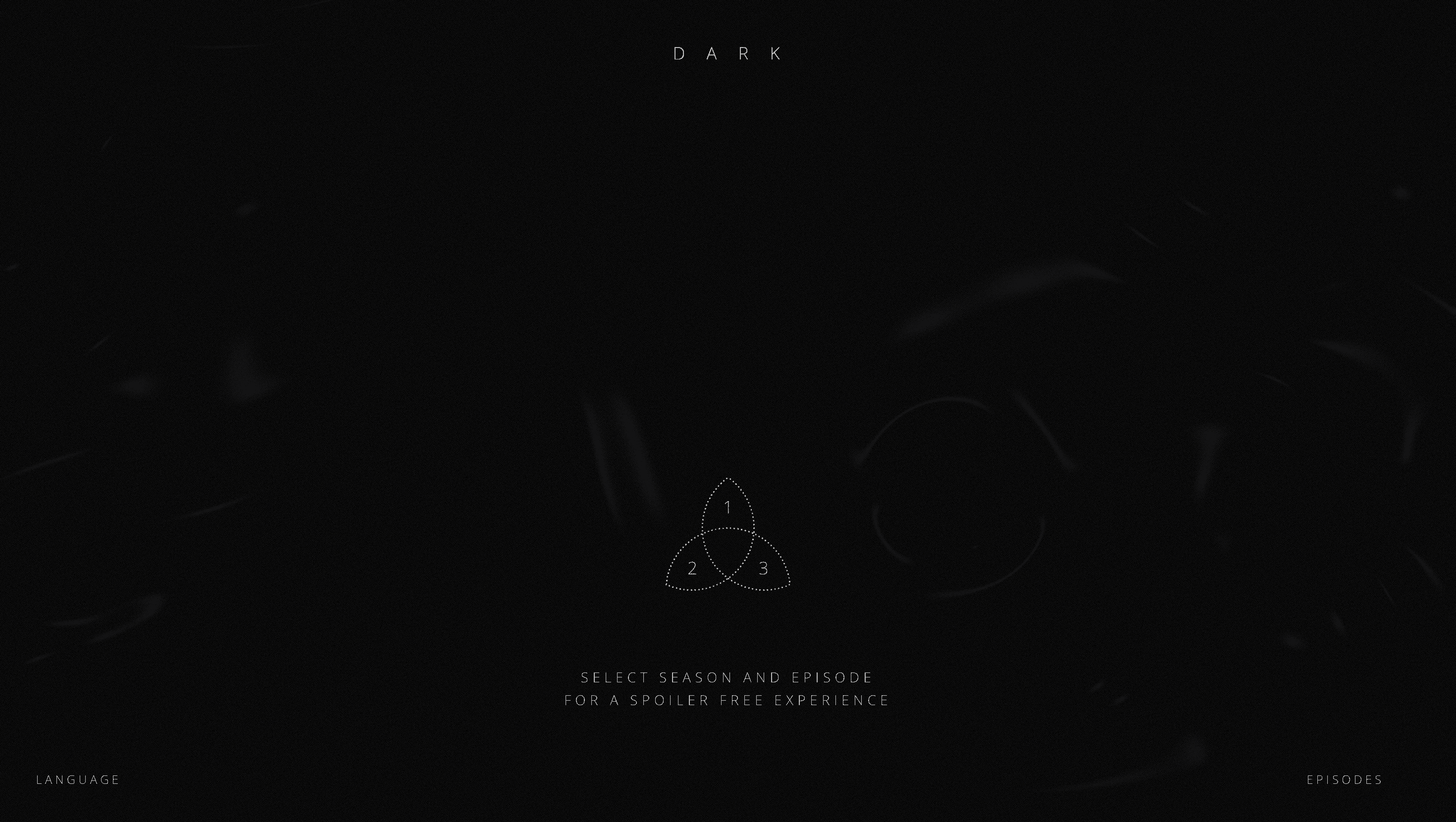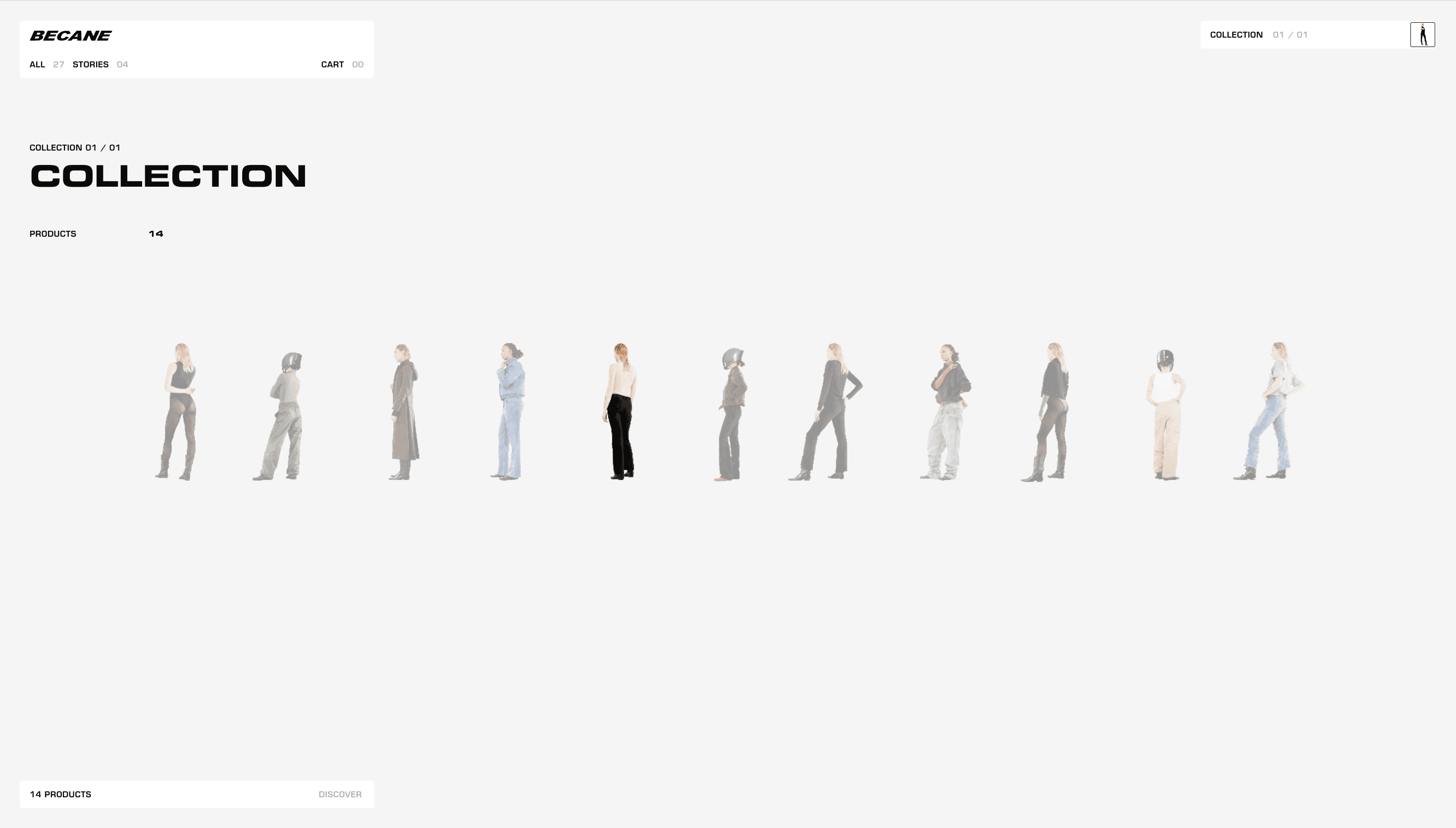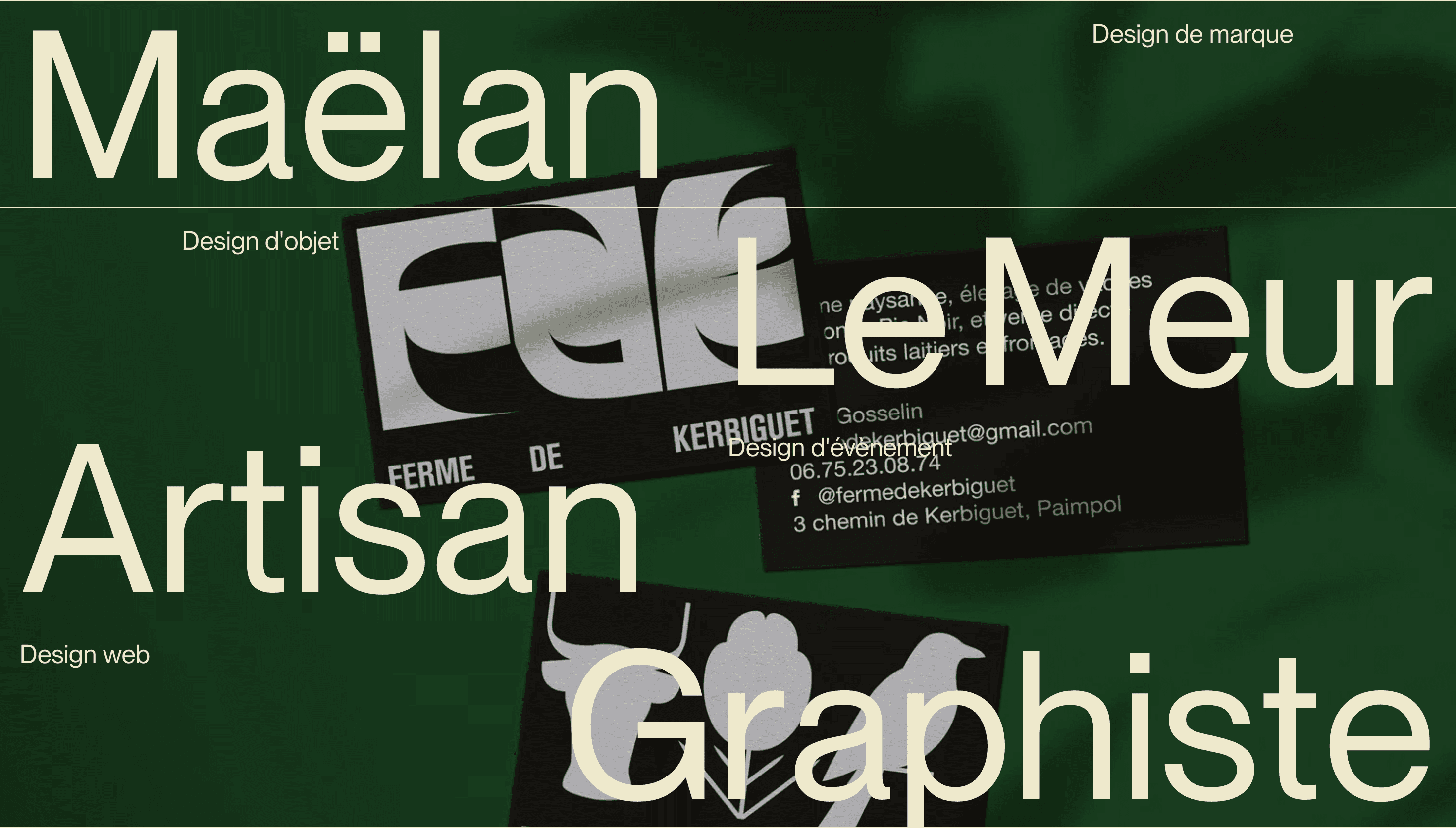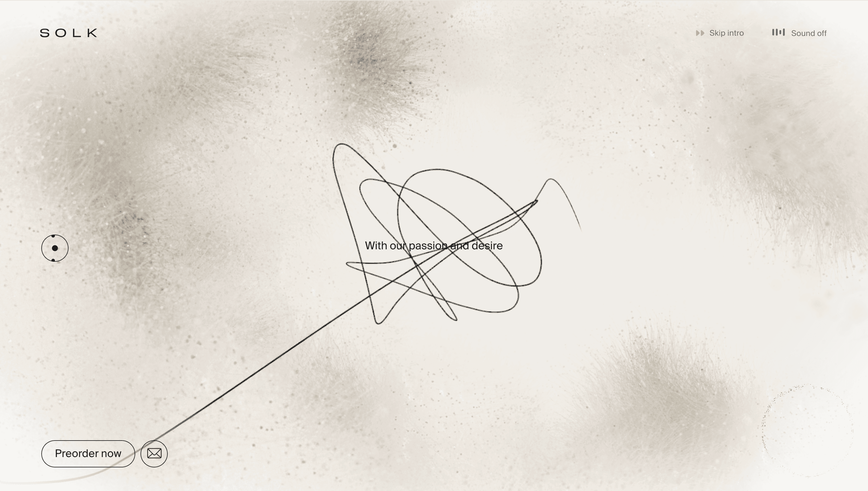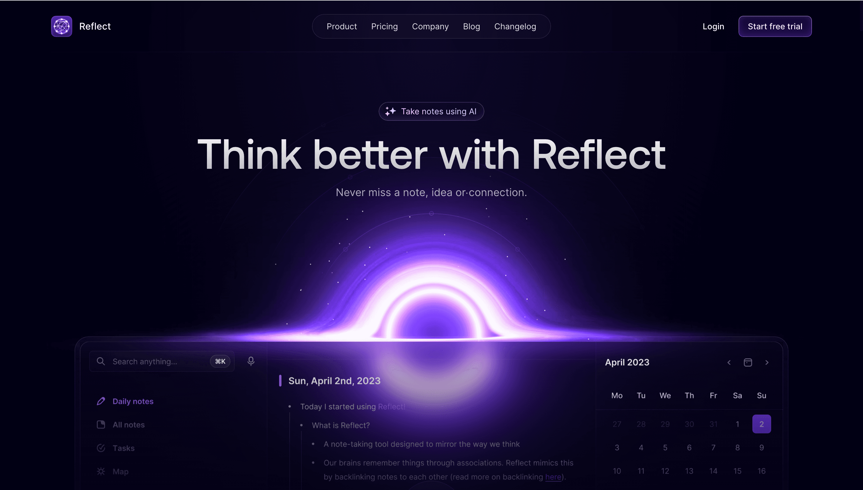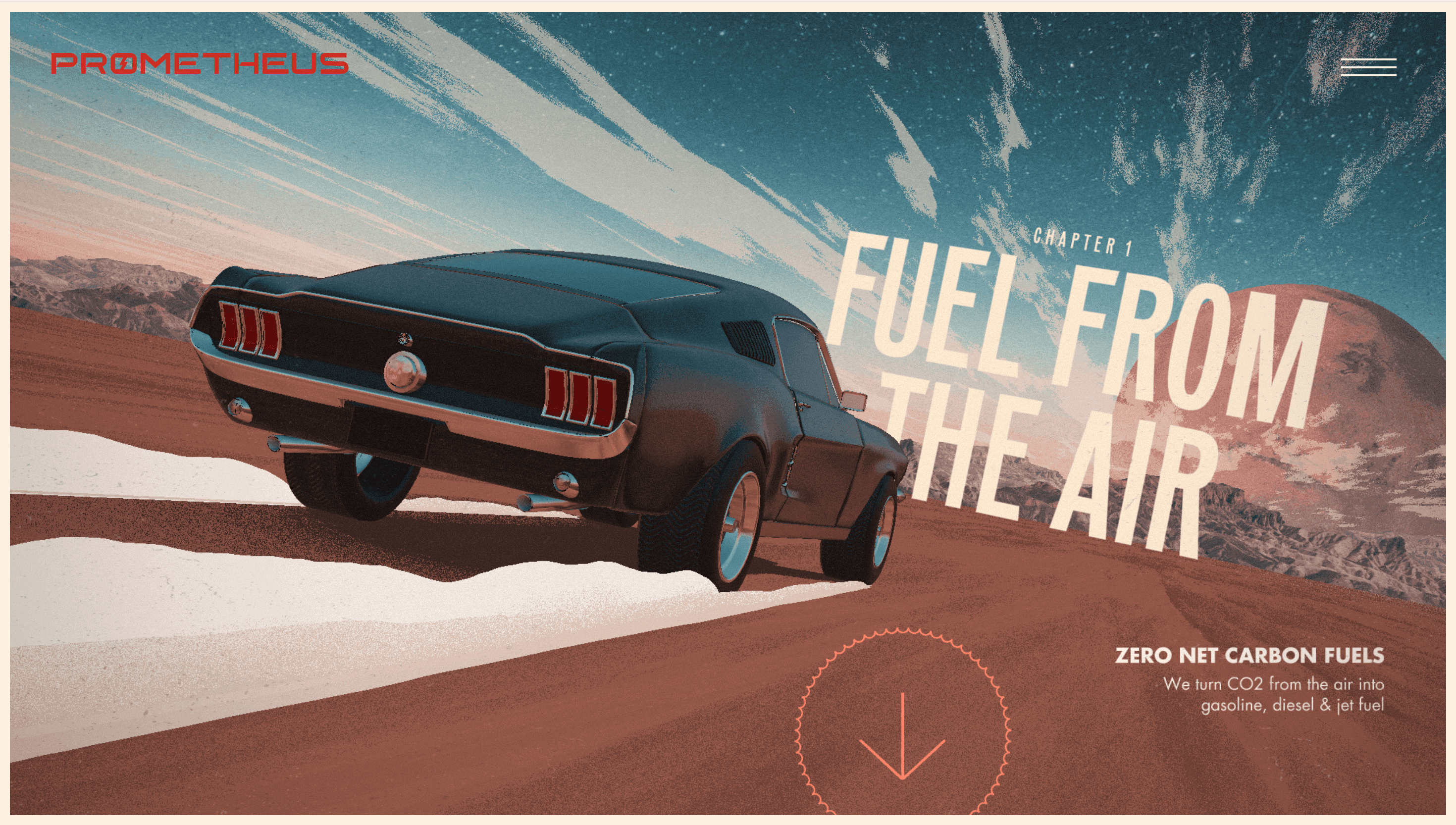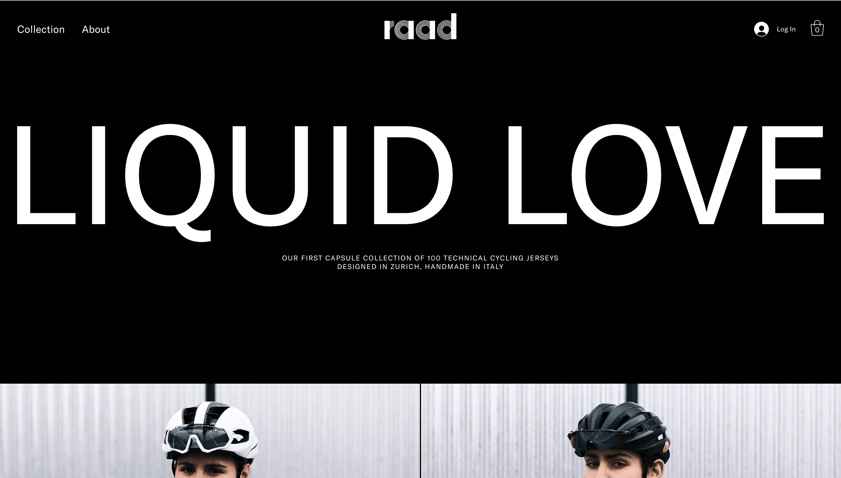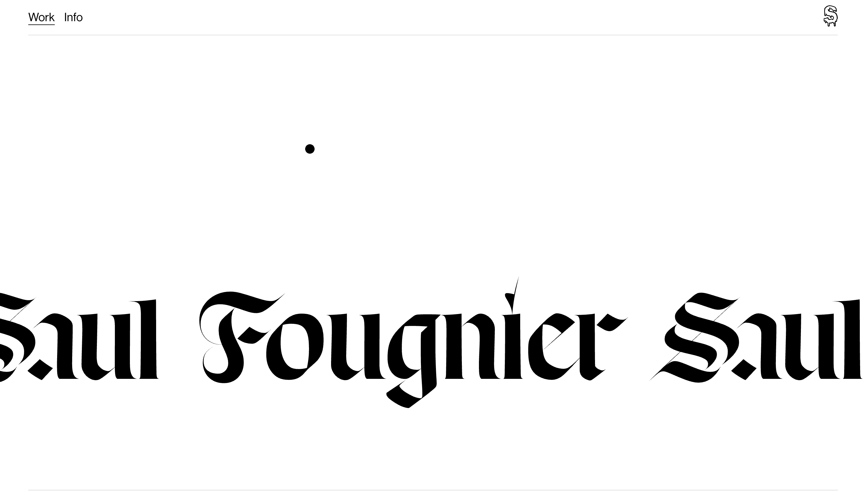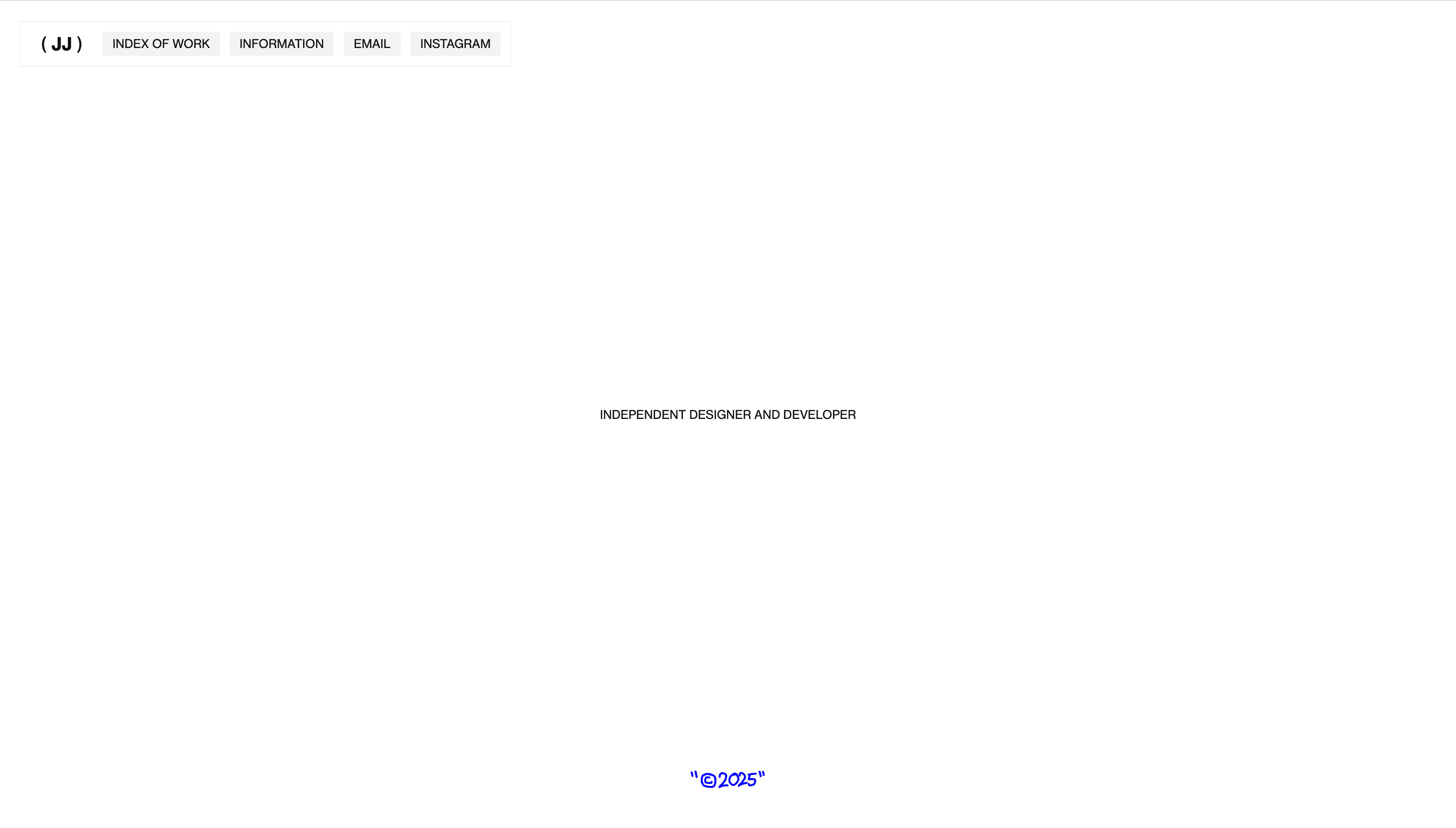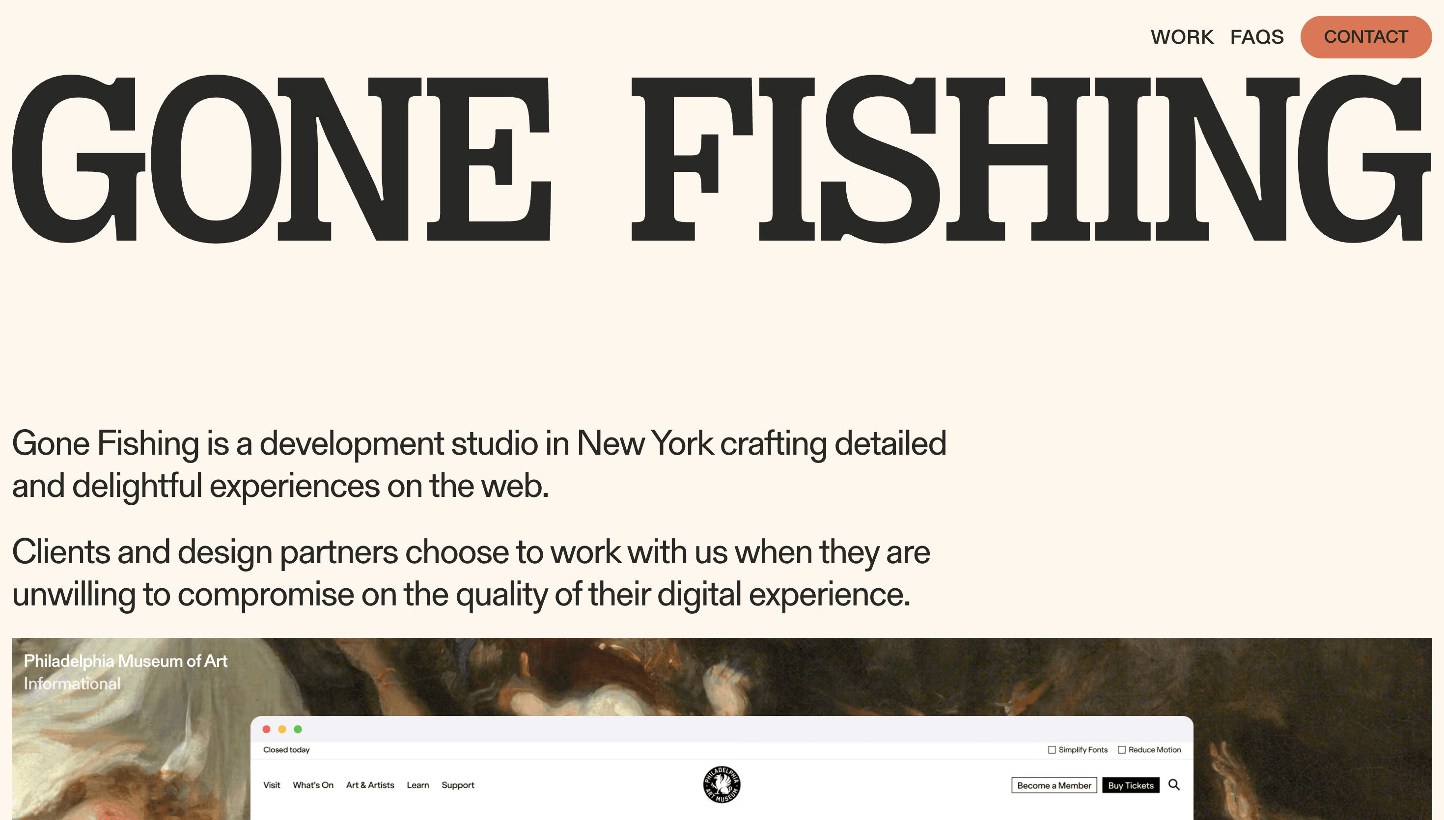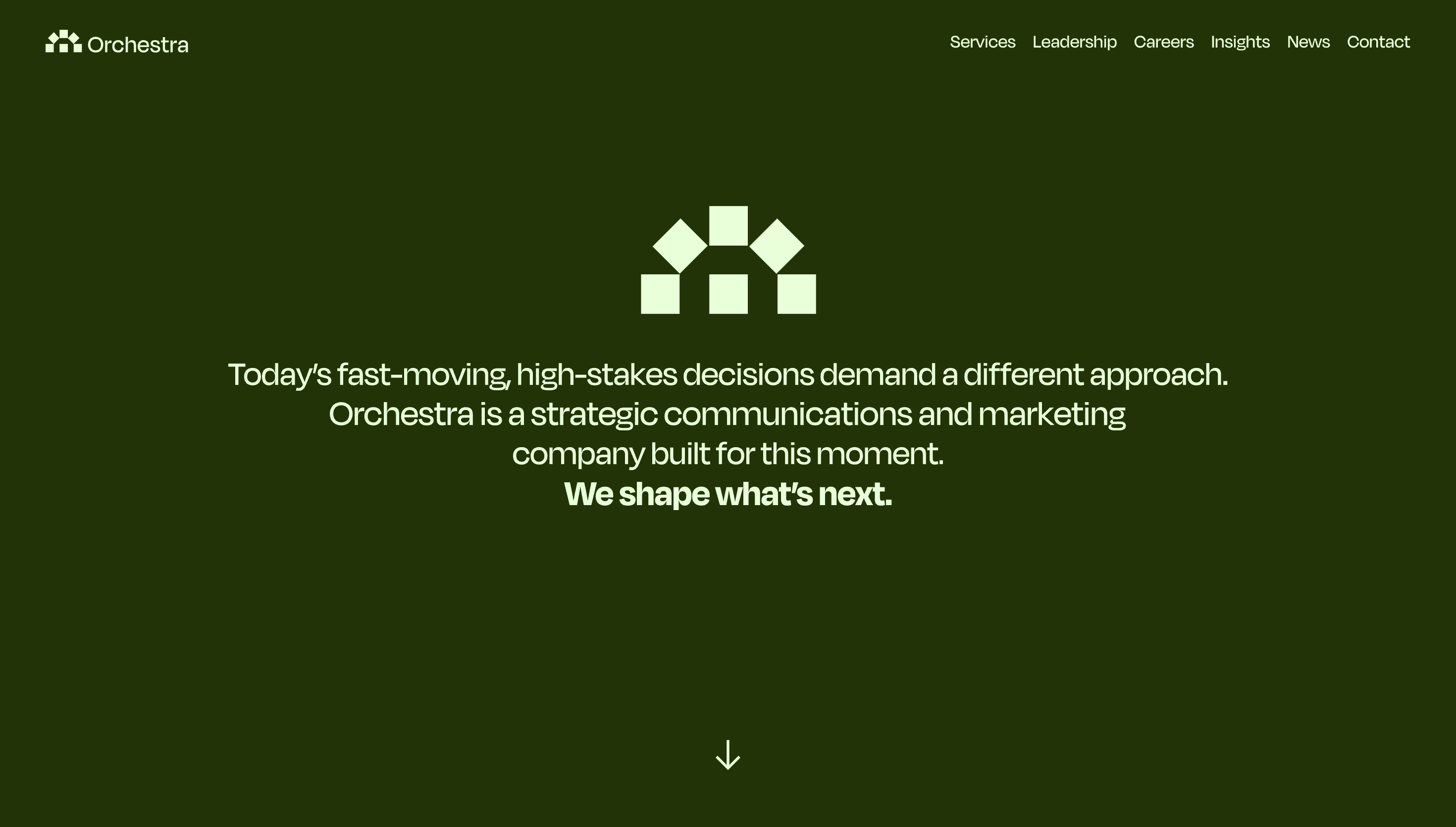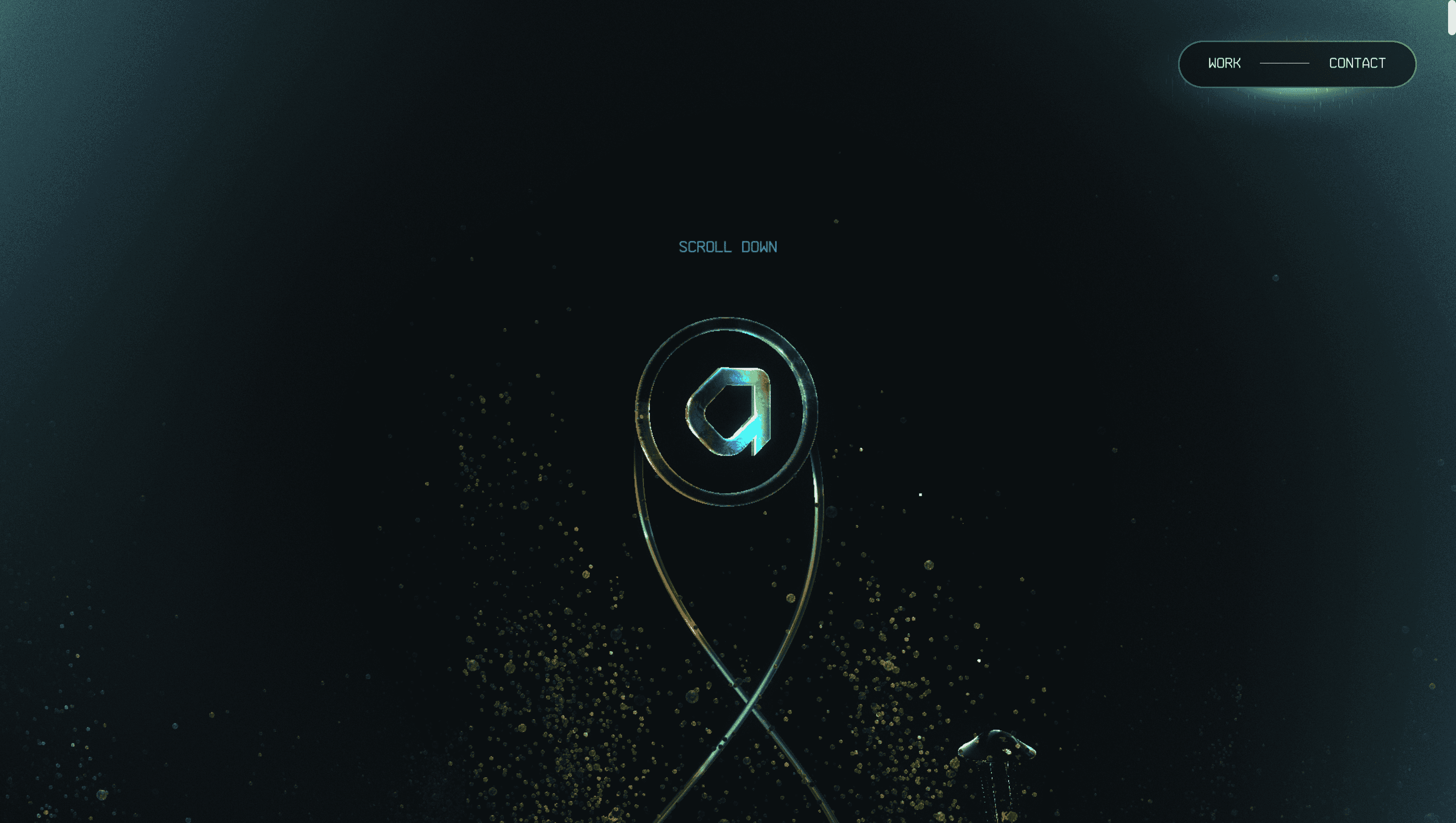
Minimal Website Design
Minimal website design is often misunderstood as visual emptiness. In practice, it is careful prioritization. This collection gathers examples where every element has a clear purpose and where spacing, typography, and contrast do most of the communication work. Review how these websites control attention through rhythm: section density changes, headline hierarchy, and subtle component variation create momentum without relying on noise. You can also study how minimal interfaces handle product detail, portfolio content, and storytelling while preserving clean layouts. In many examples, interaction design is intentionally quiet, with lightweight motion and simple hover states that support comprehension. Another useful lesson is color discipline. The best minimal websites use a small palette consistently, which makes brand accents feel stronger and more deliberate. If your team is redesigning a cluttered interface, this set offers practical references for reducing UI complexity, improving readability, and making calls to action stand out through structure rather than decoration.