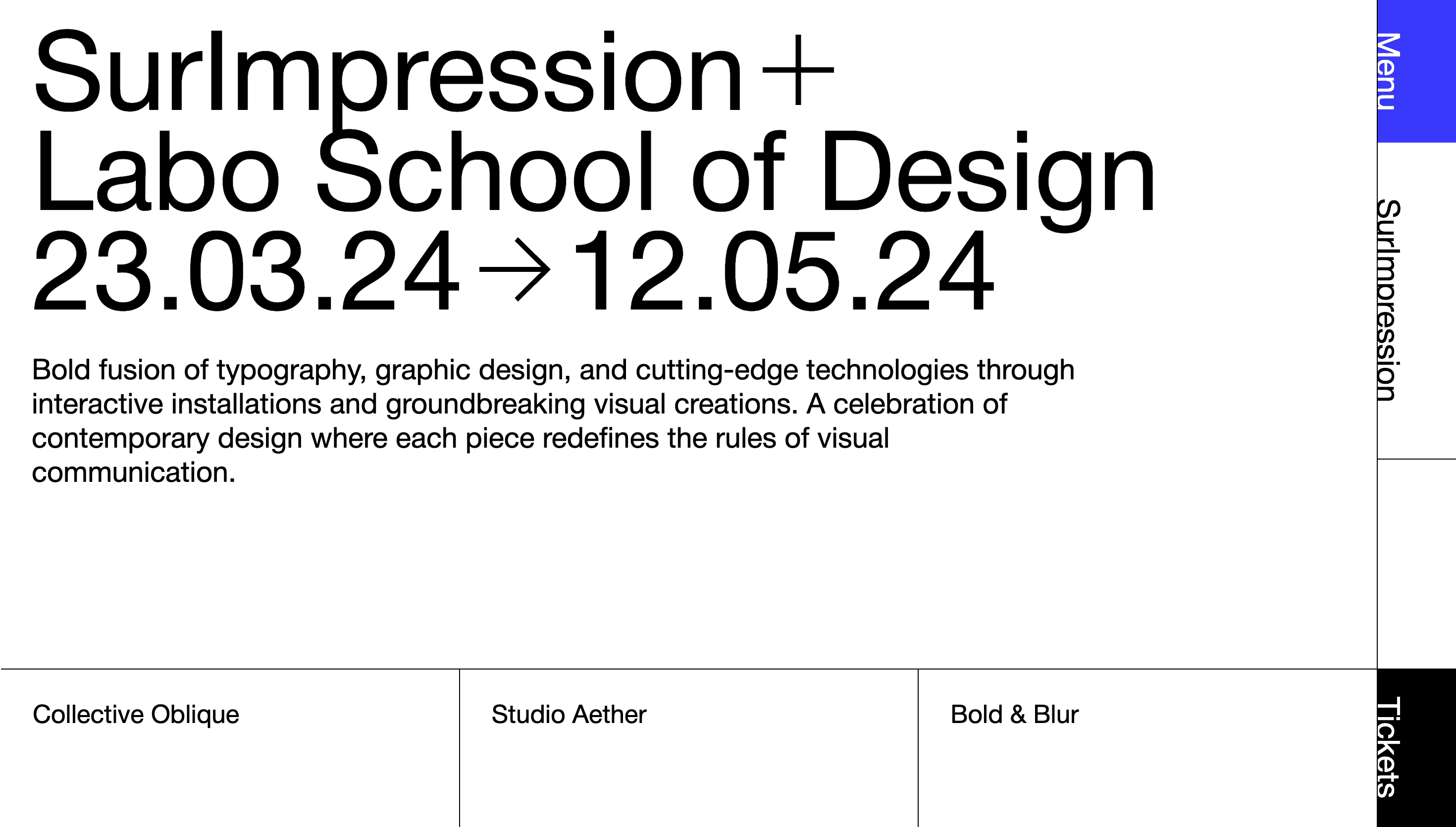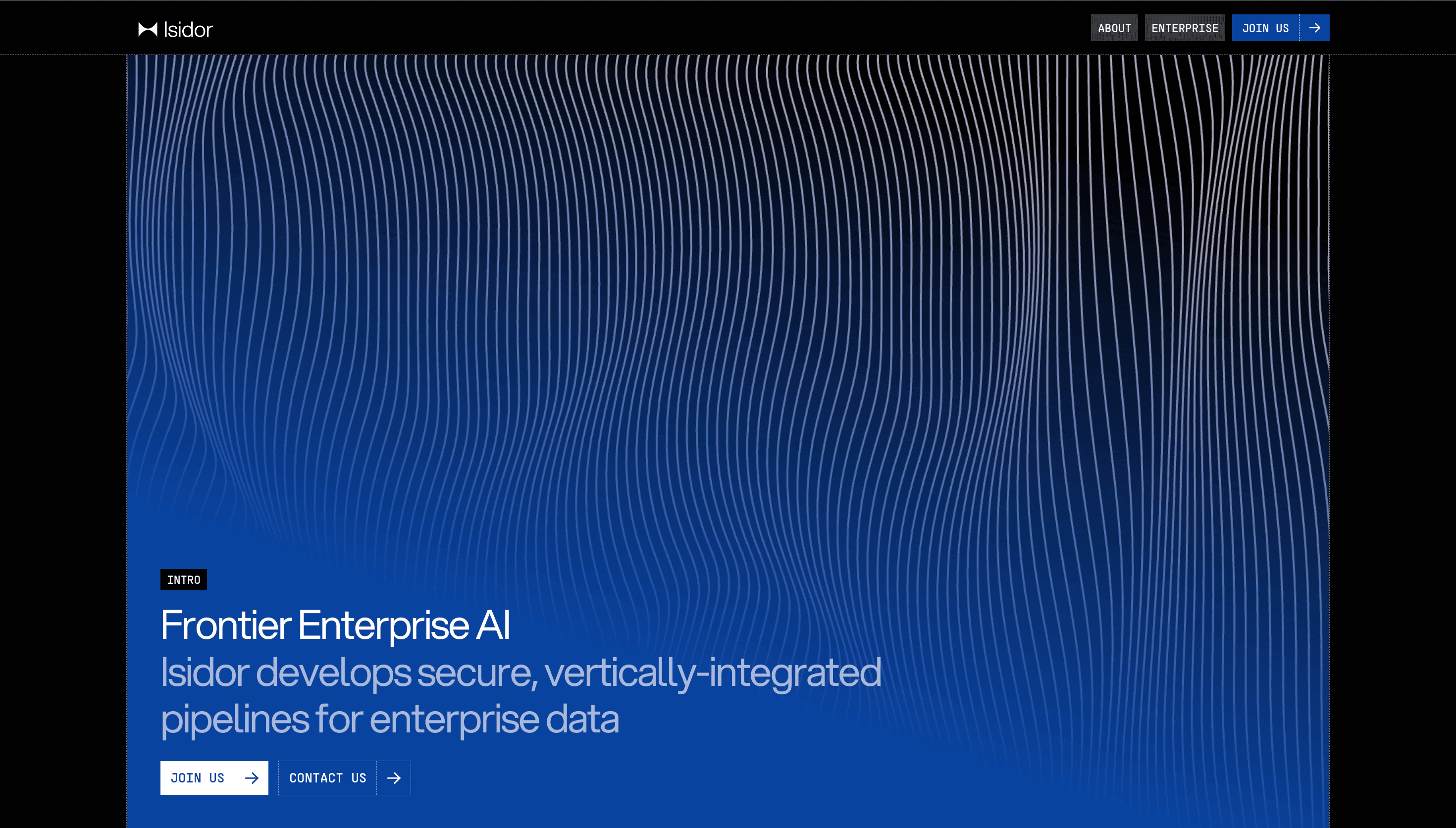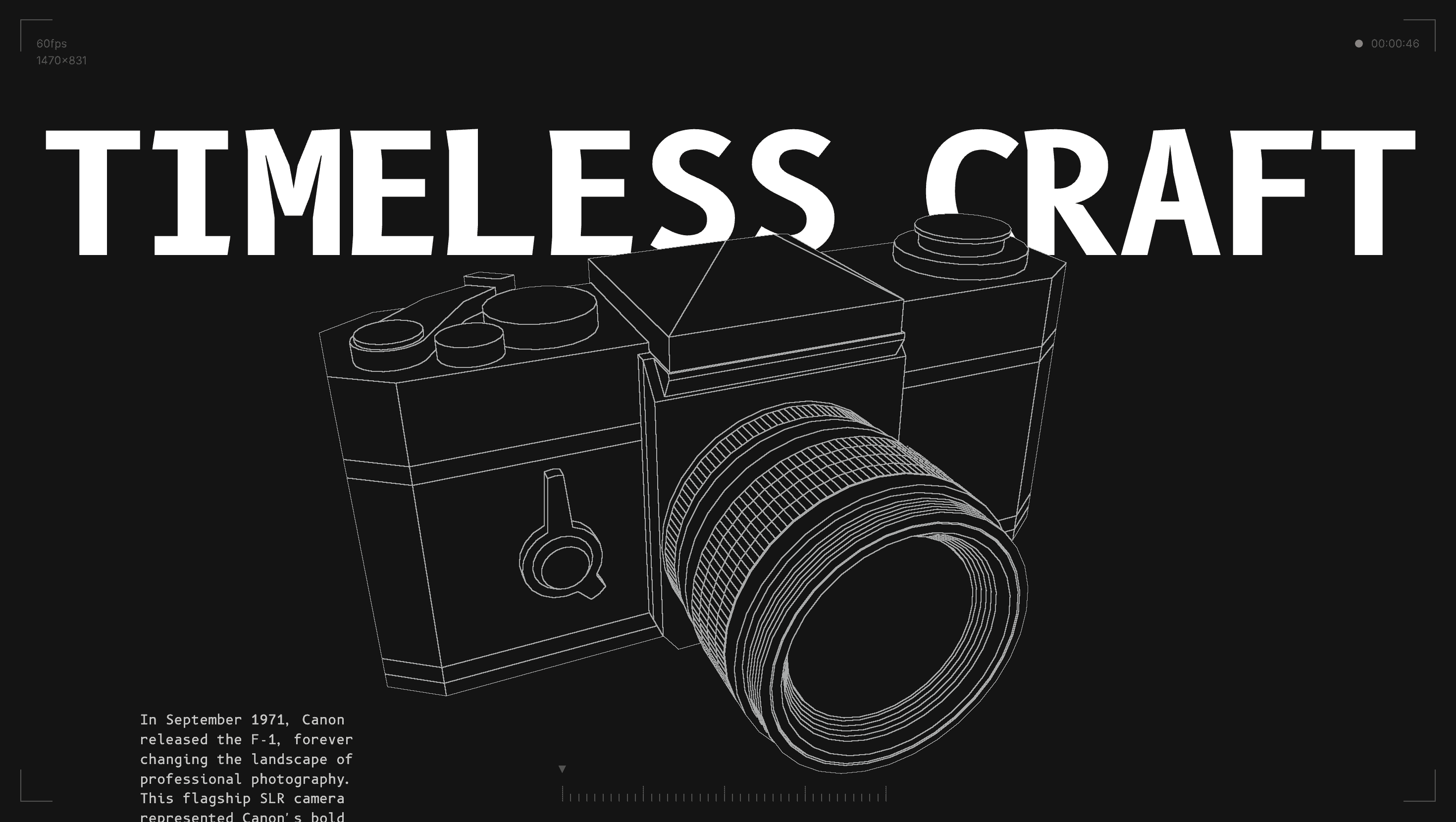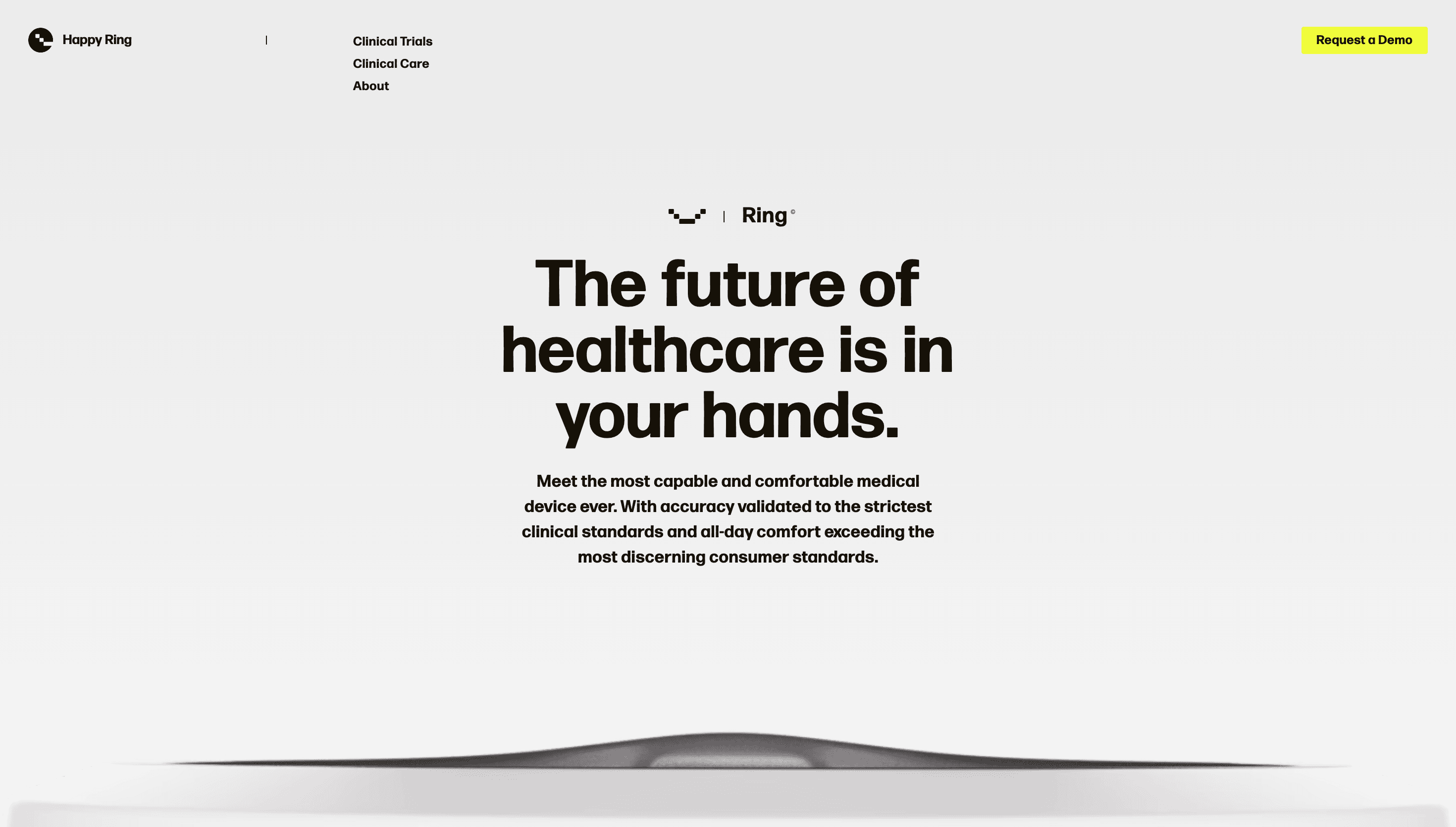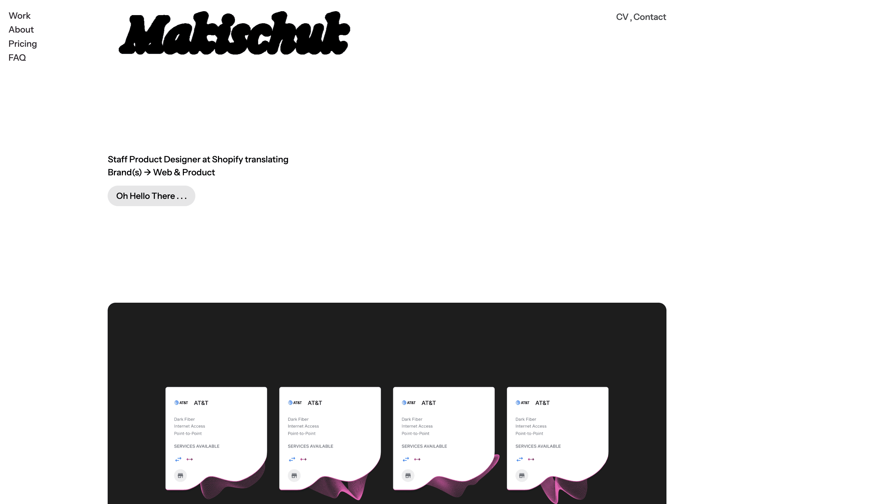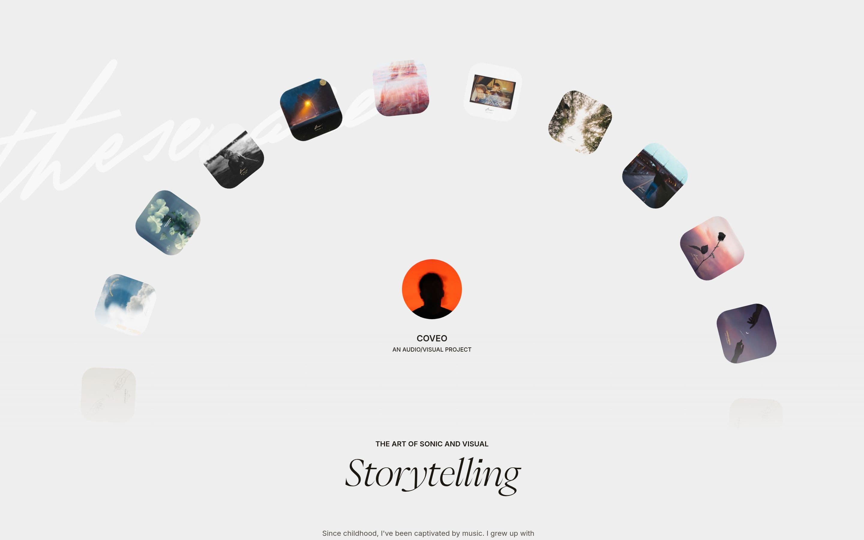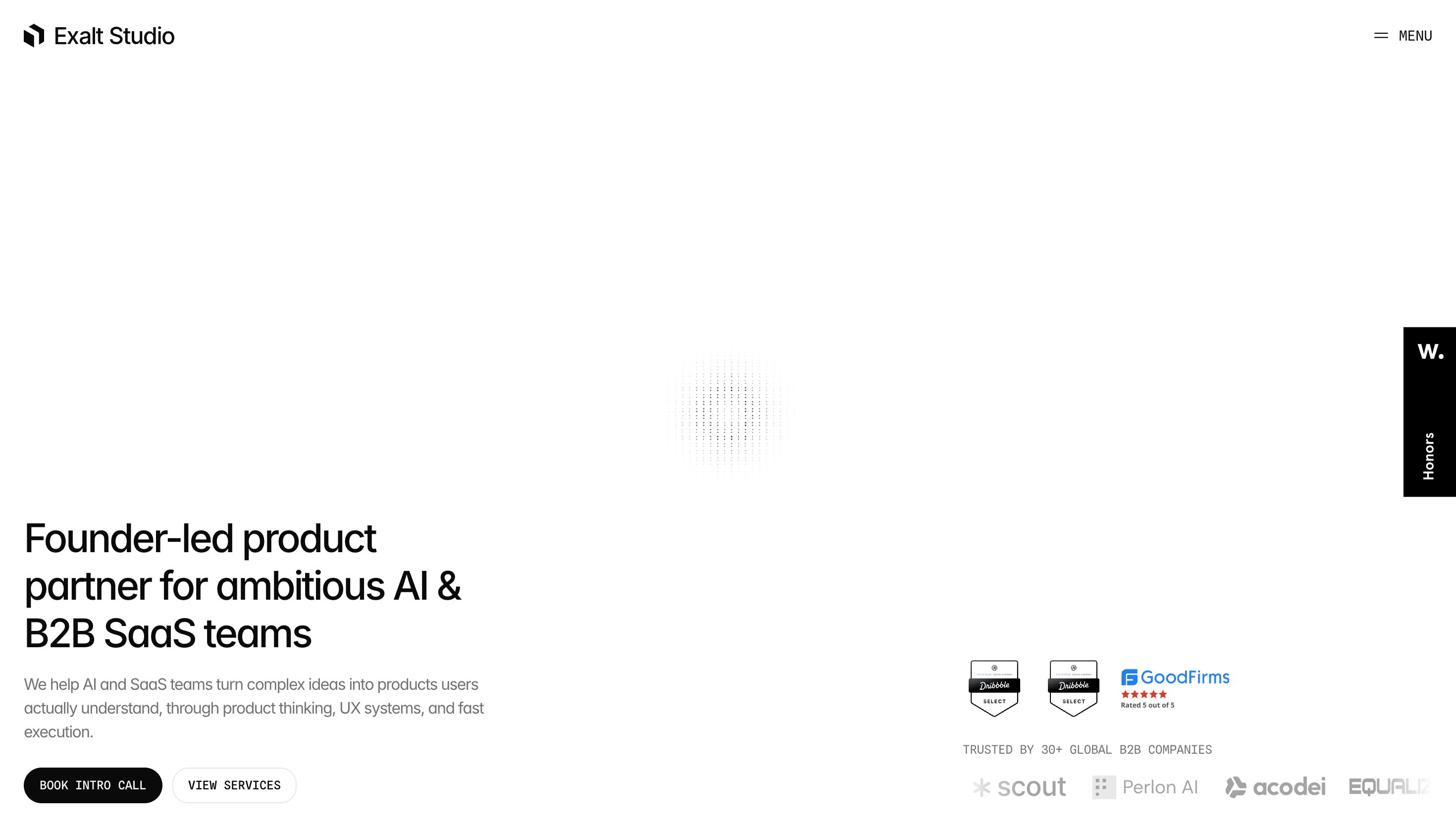
Dark UI Website Design
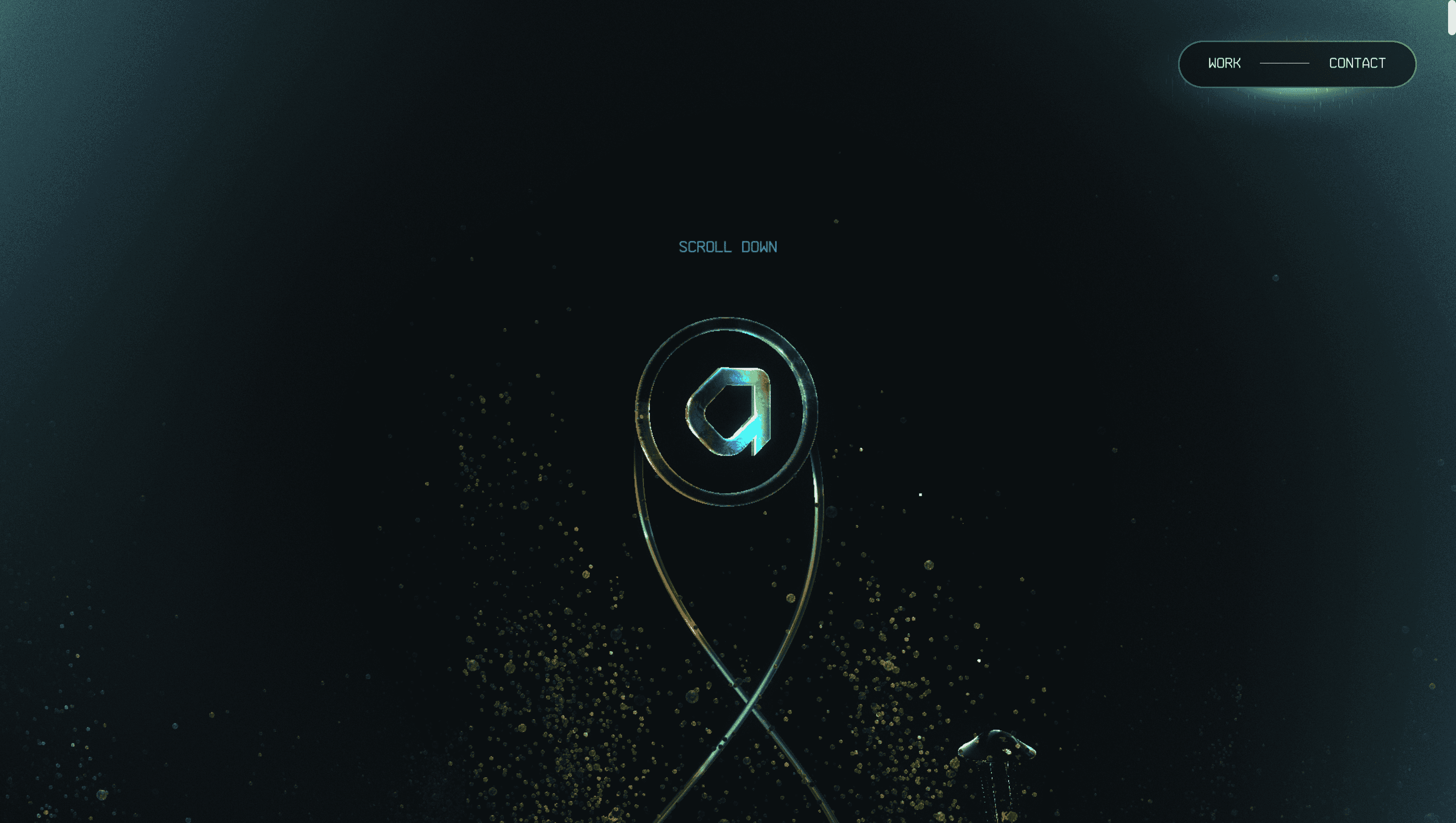
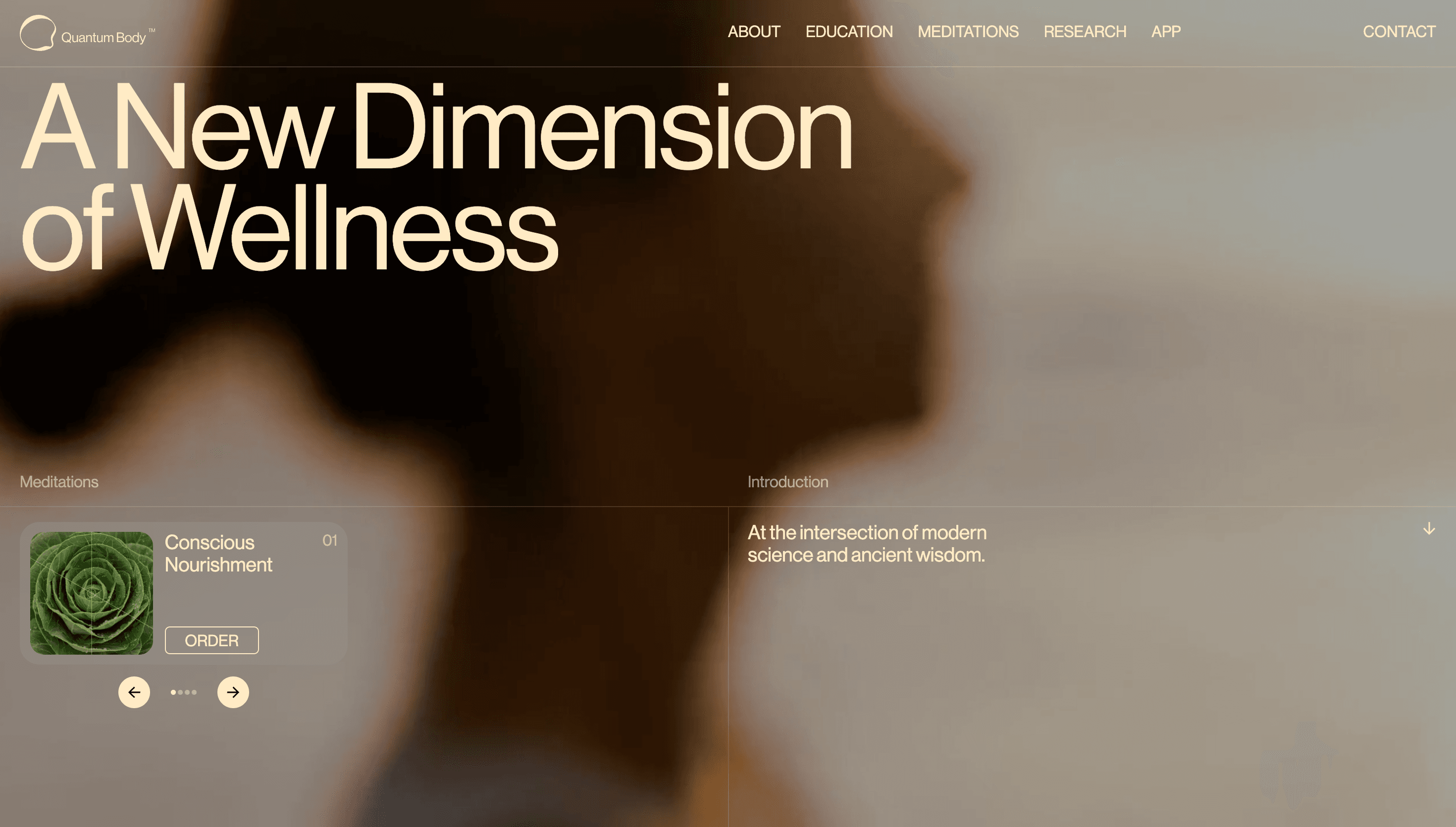
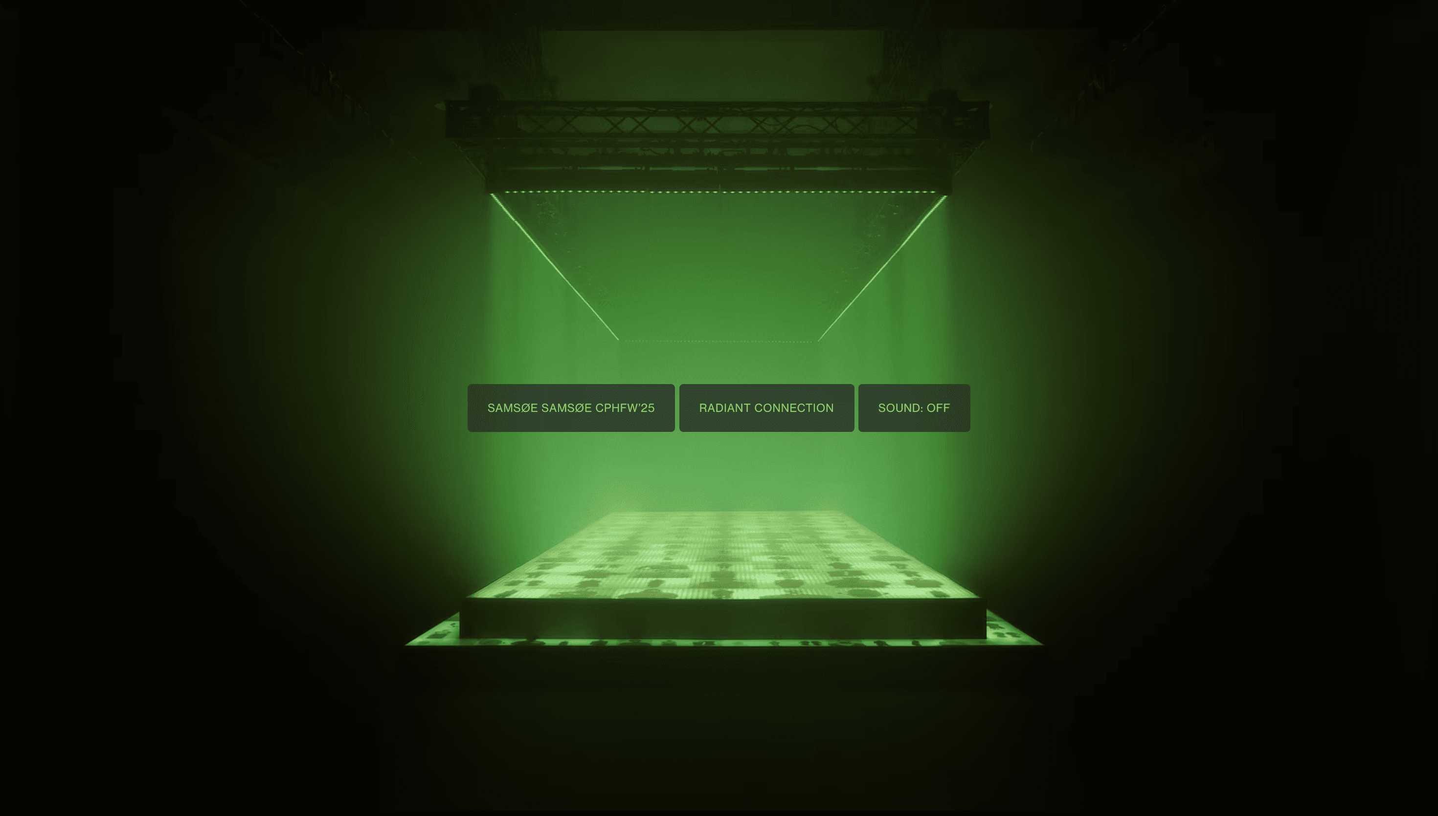
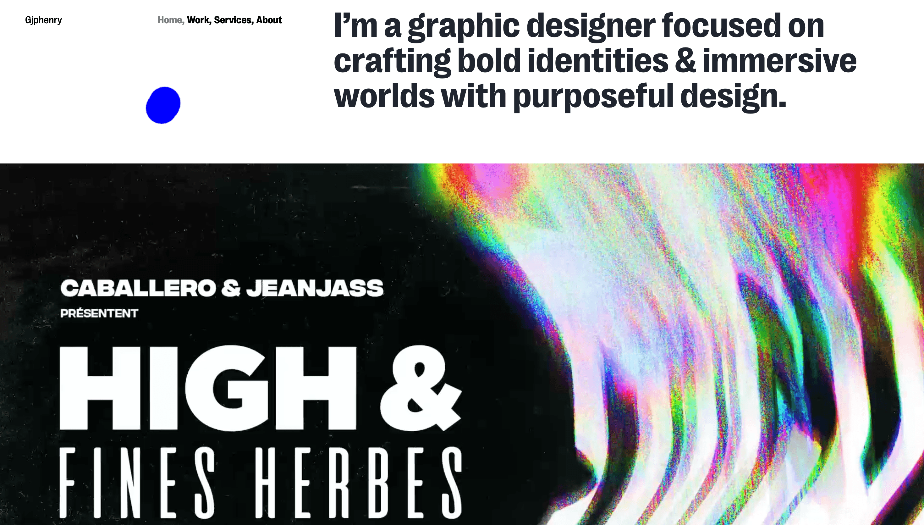
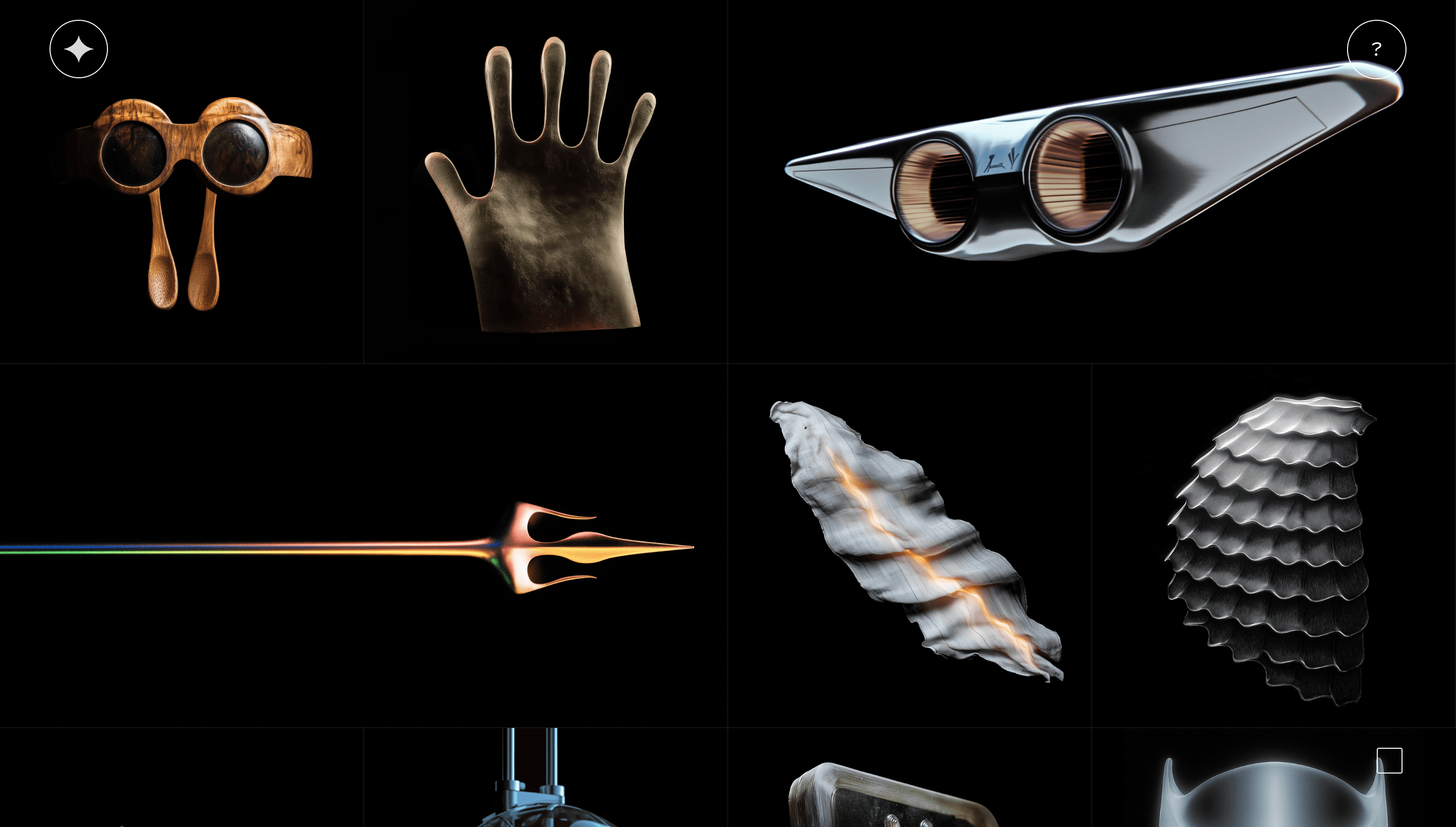
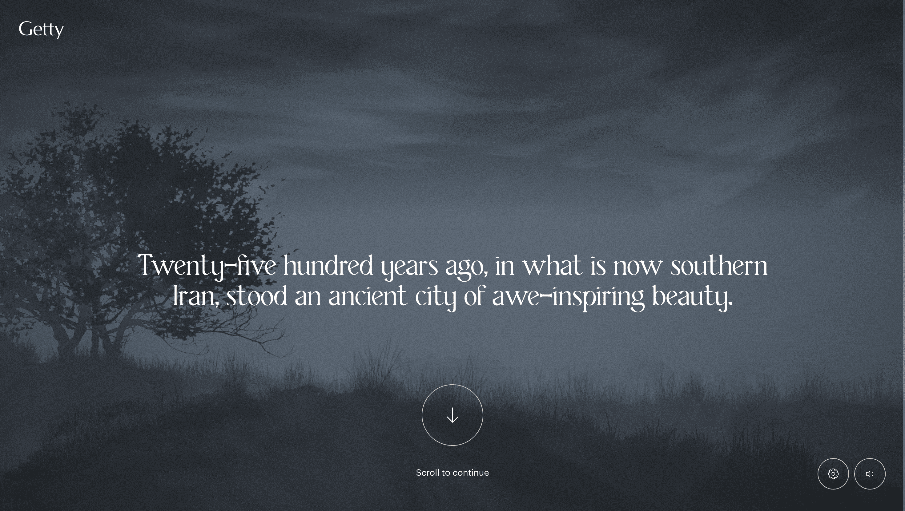
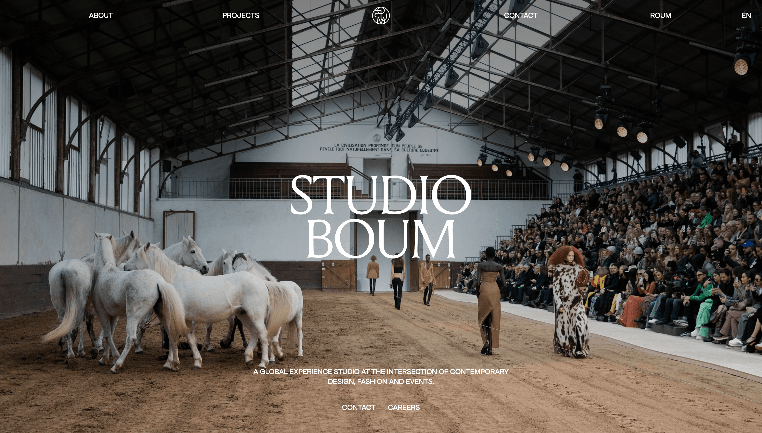
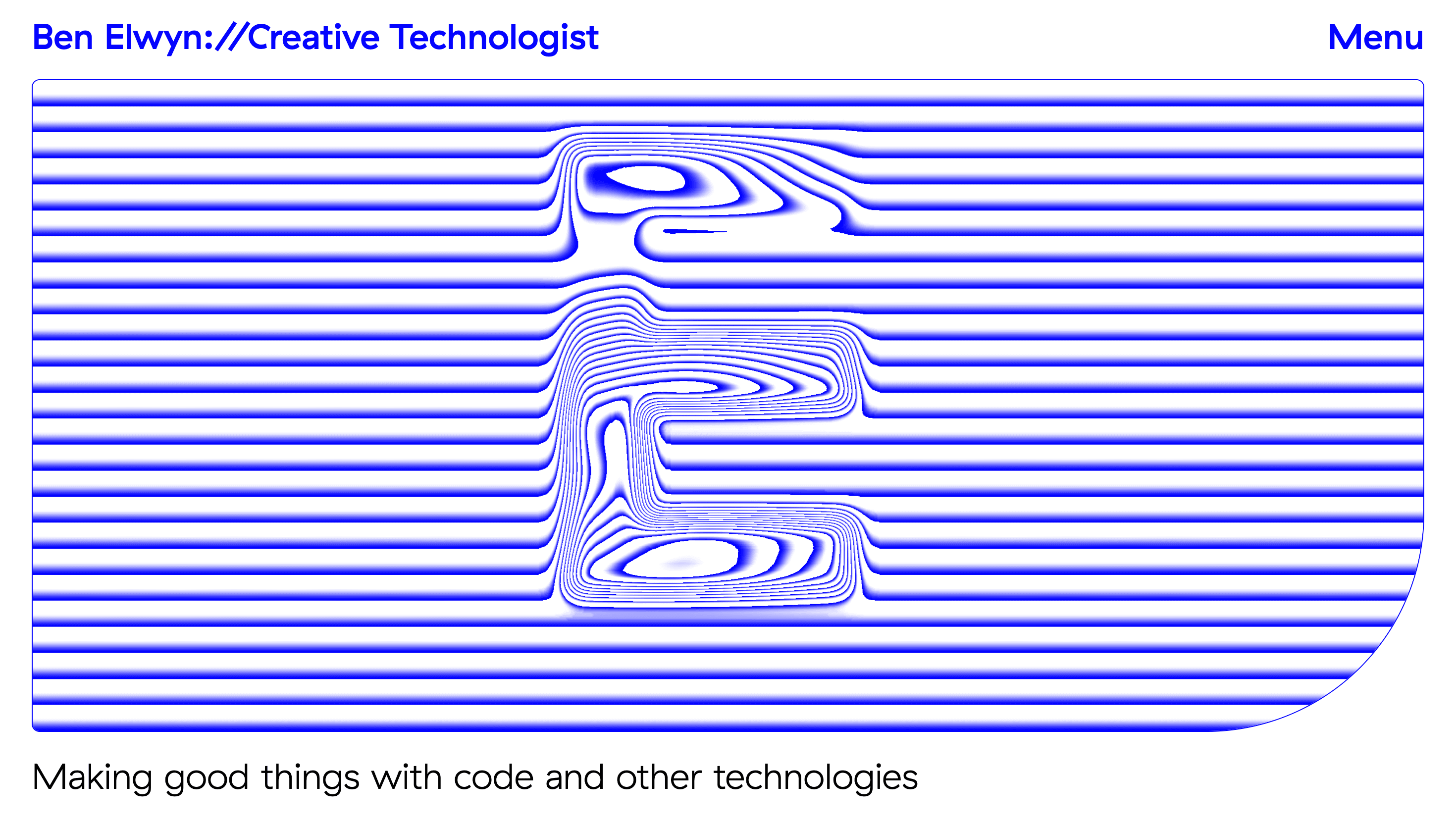
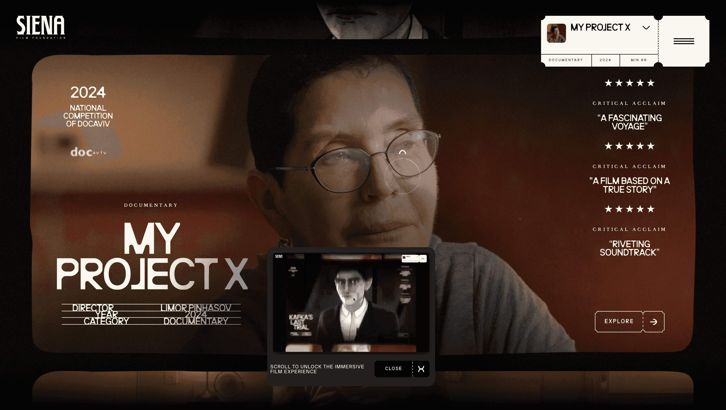
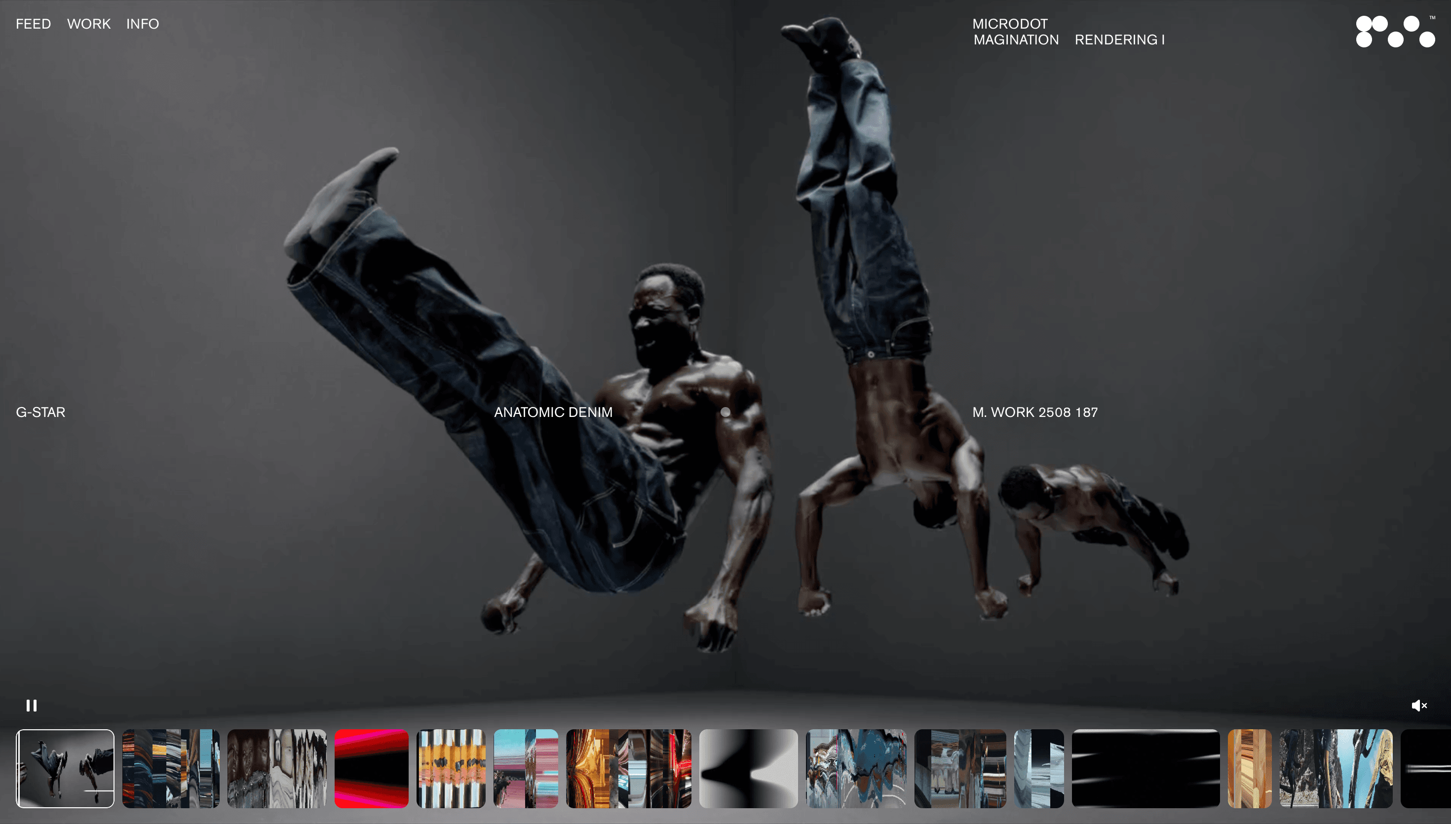
Dark UI website design can feel premium and cinematic, but it only works when contrast and hierarchy are handled with precision. This collection gathers references that demonstrate readable dark interfaces across landing pages, portfolios, and product sites. Notice how successful examples avoid flat black surfaces by layering tones, gradients, and texture to create depth. Typography choices are equally important. The best dark UI websites tune font weight, line height, and spacing to keep long-form content legible while preserving atmosphere. Study how color accents are used sparingly to guide attention toward key interactions, tags, and conversion points. You will also see practical strategies for media-heavy sections, where screenshots and photography need controlled framing to avoid visual fatigue. If you are building a dark-themed experience, this set helps you benchmark accessibility, emotional tone, and component consistency. It is especially useful for teams designing immersive pages that still need clear navigation, scannable structure, and reliable performance.