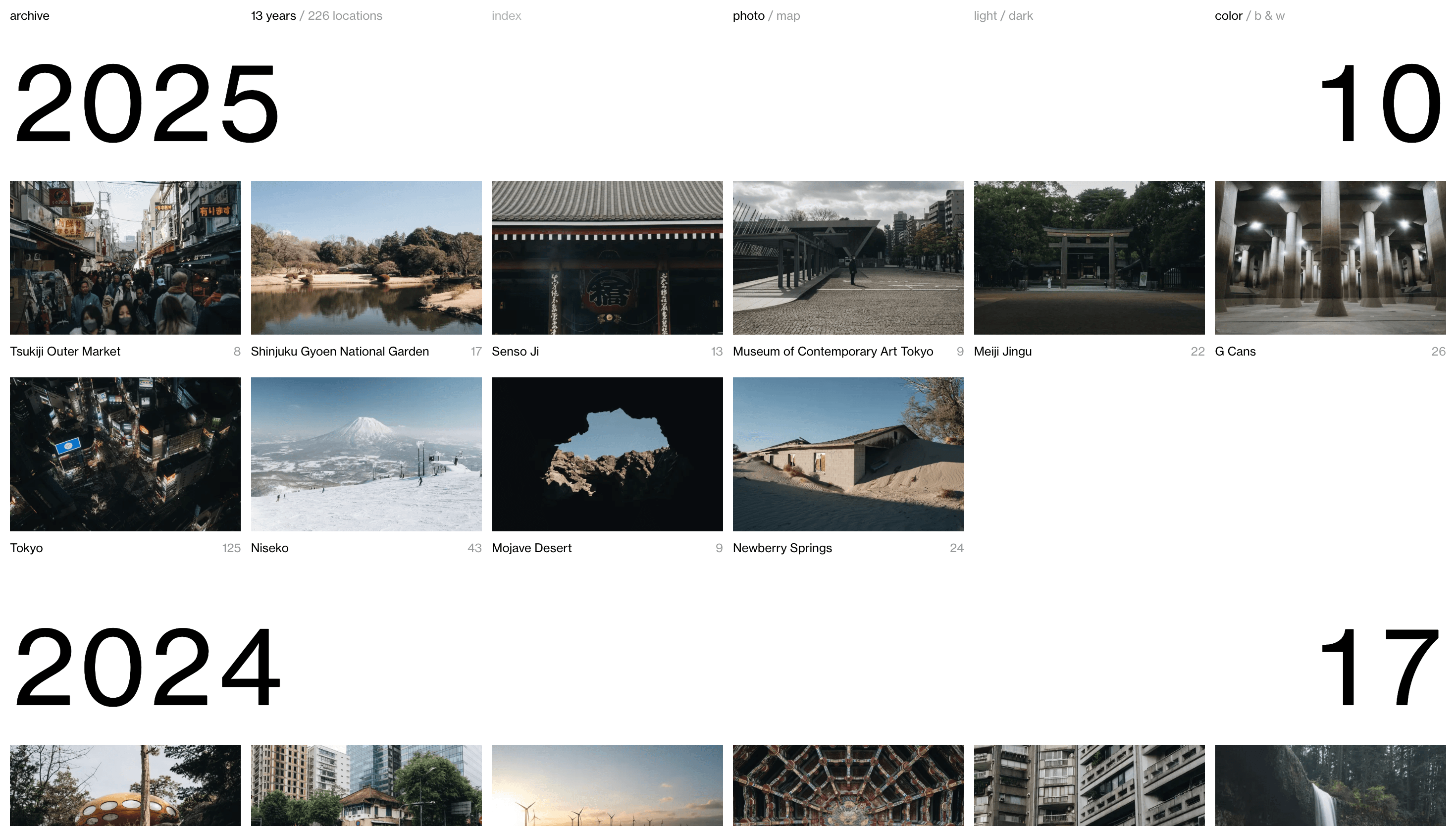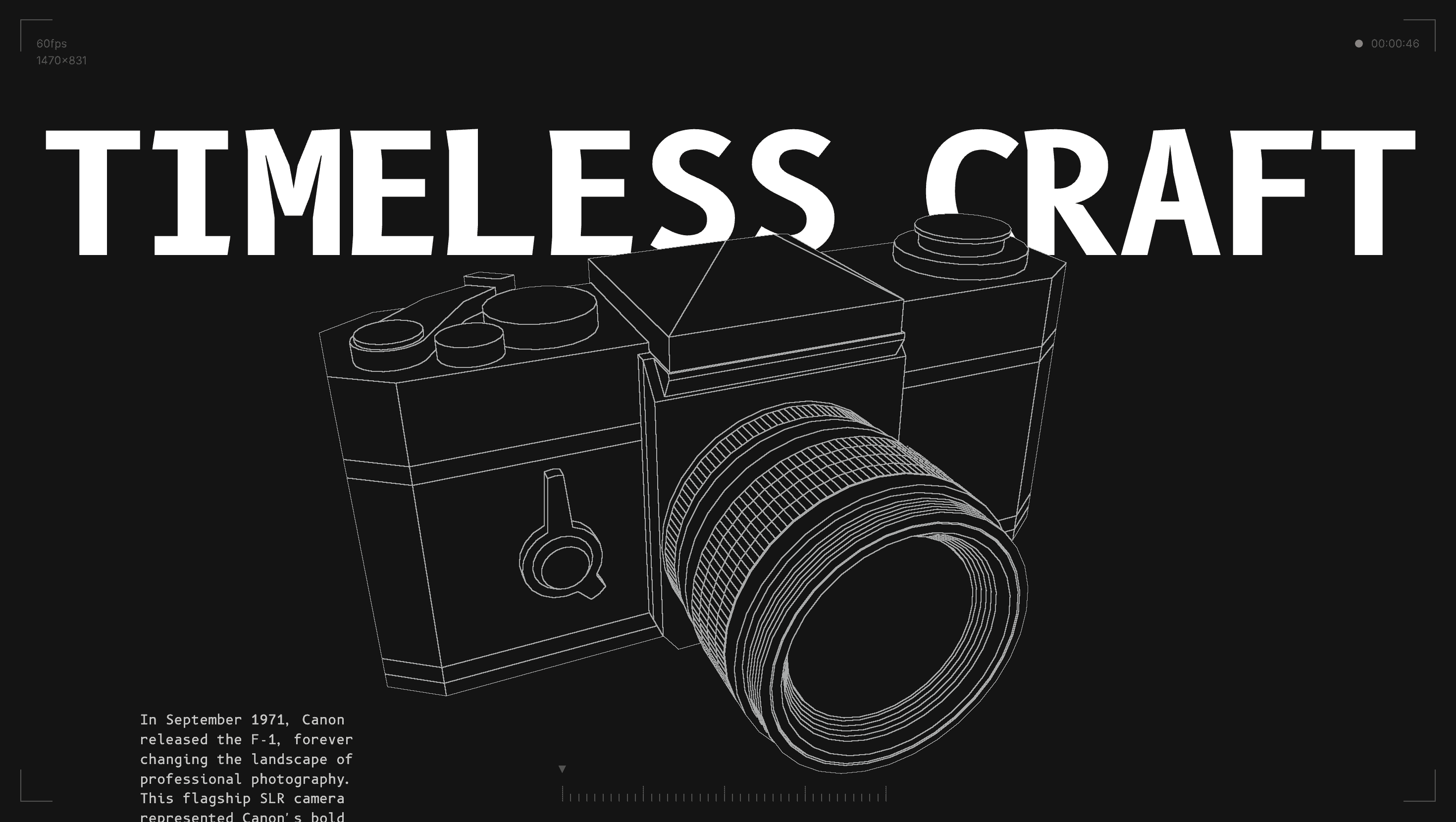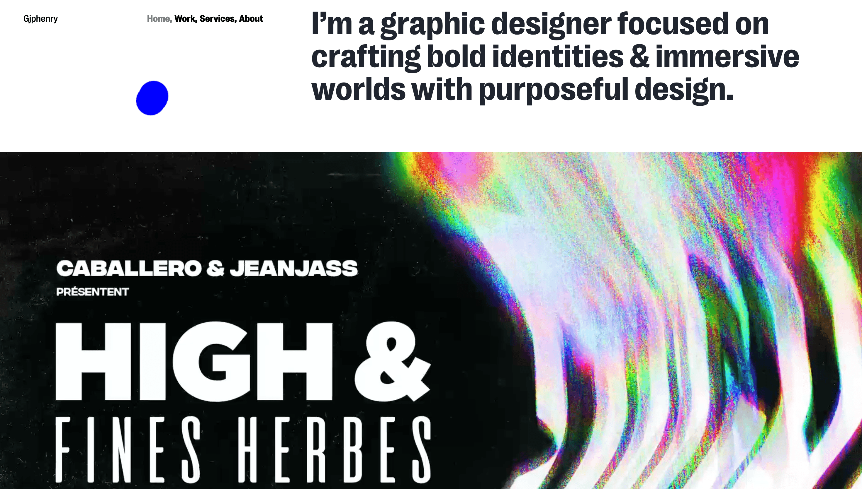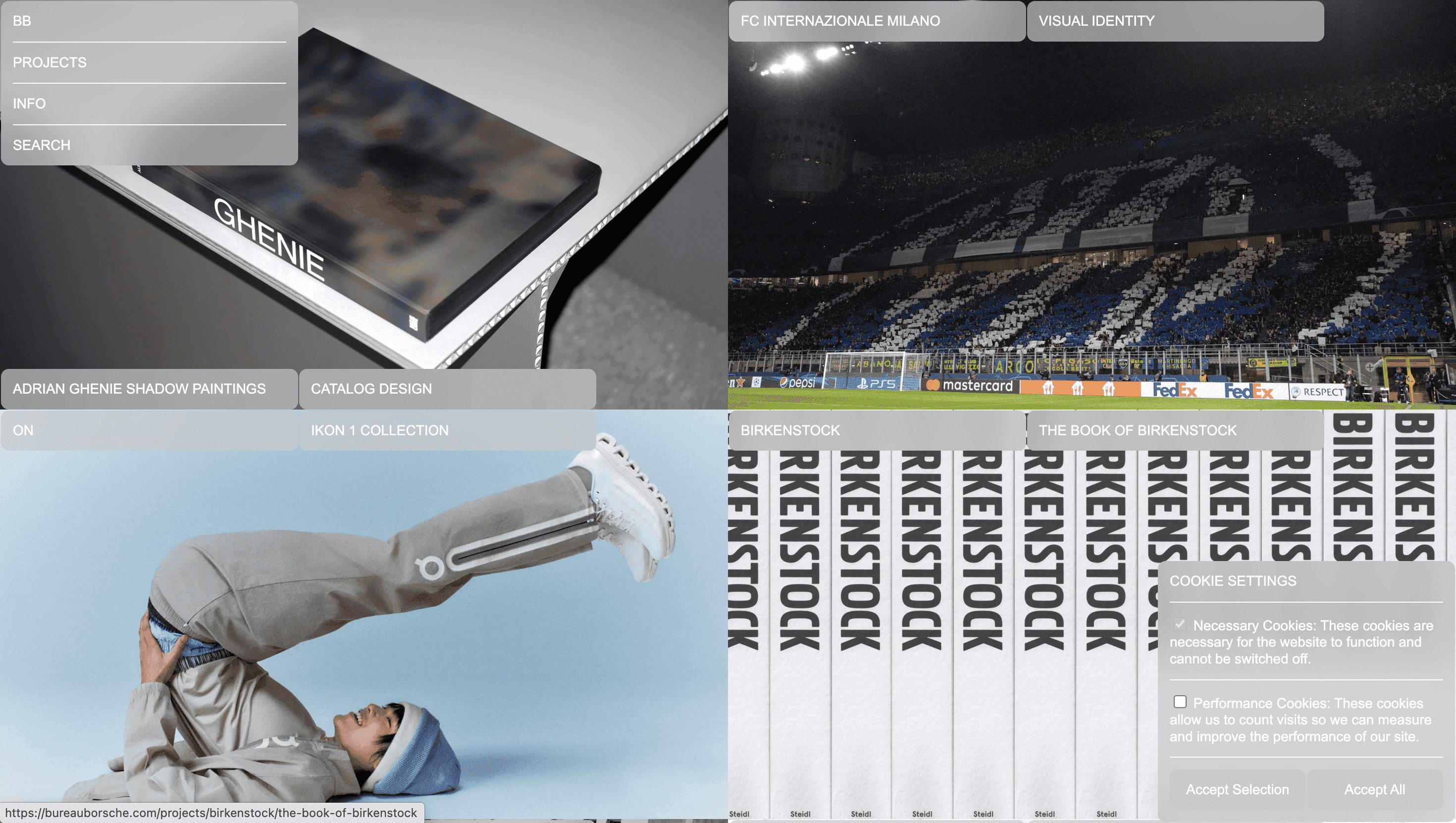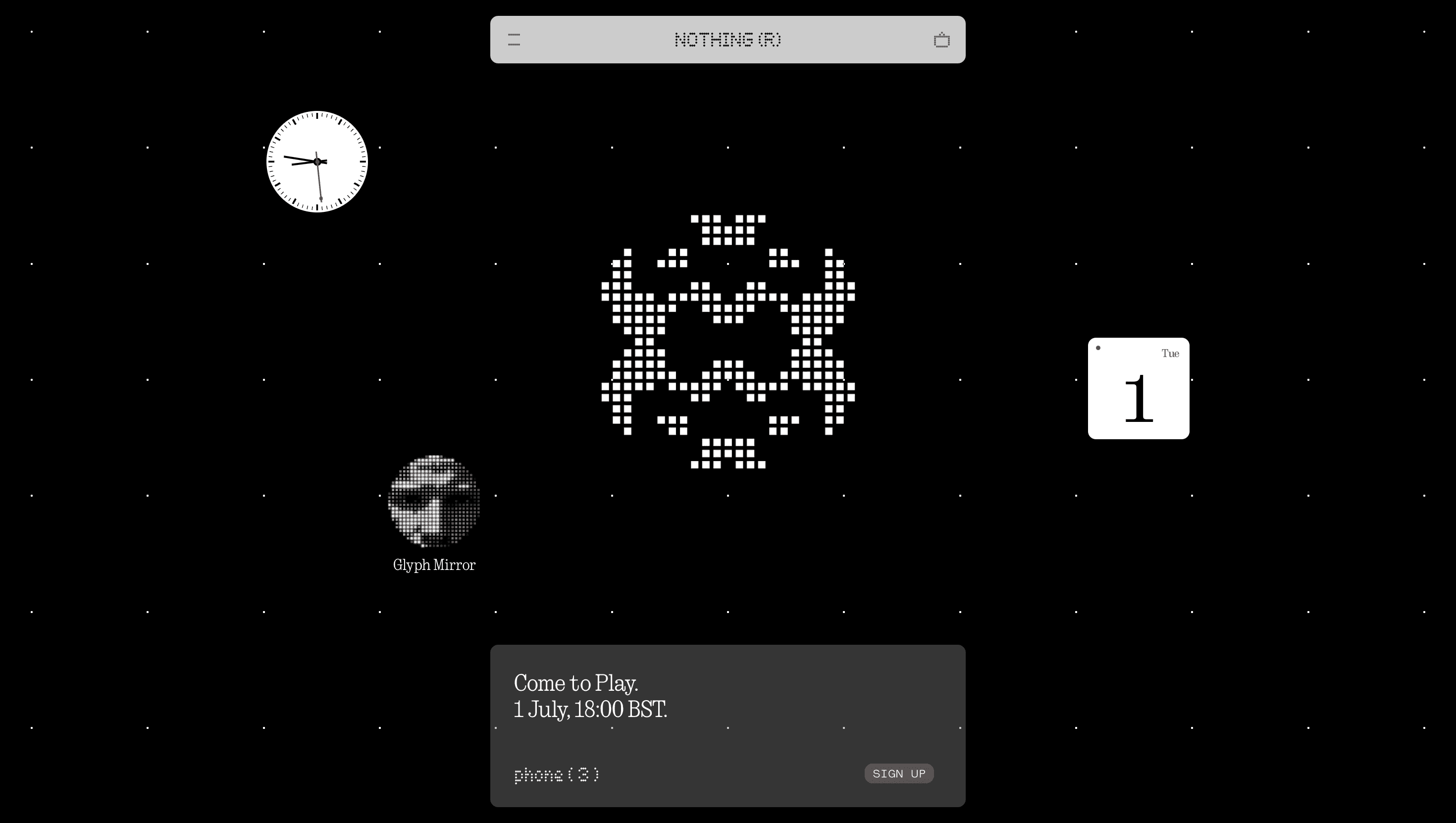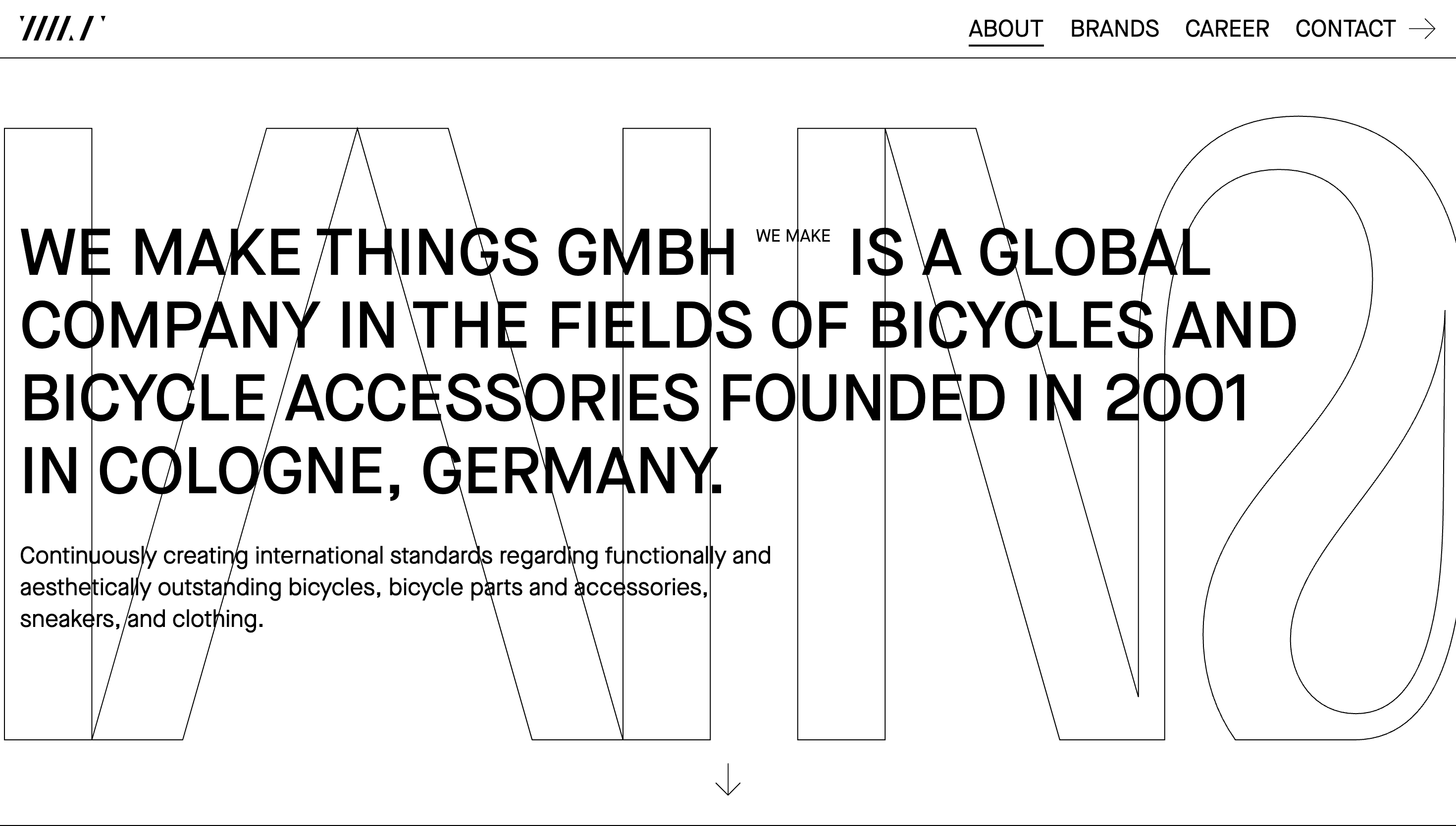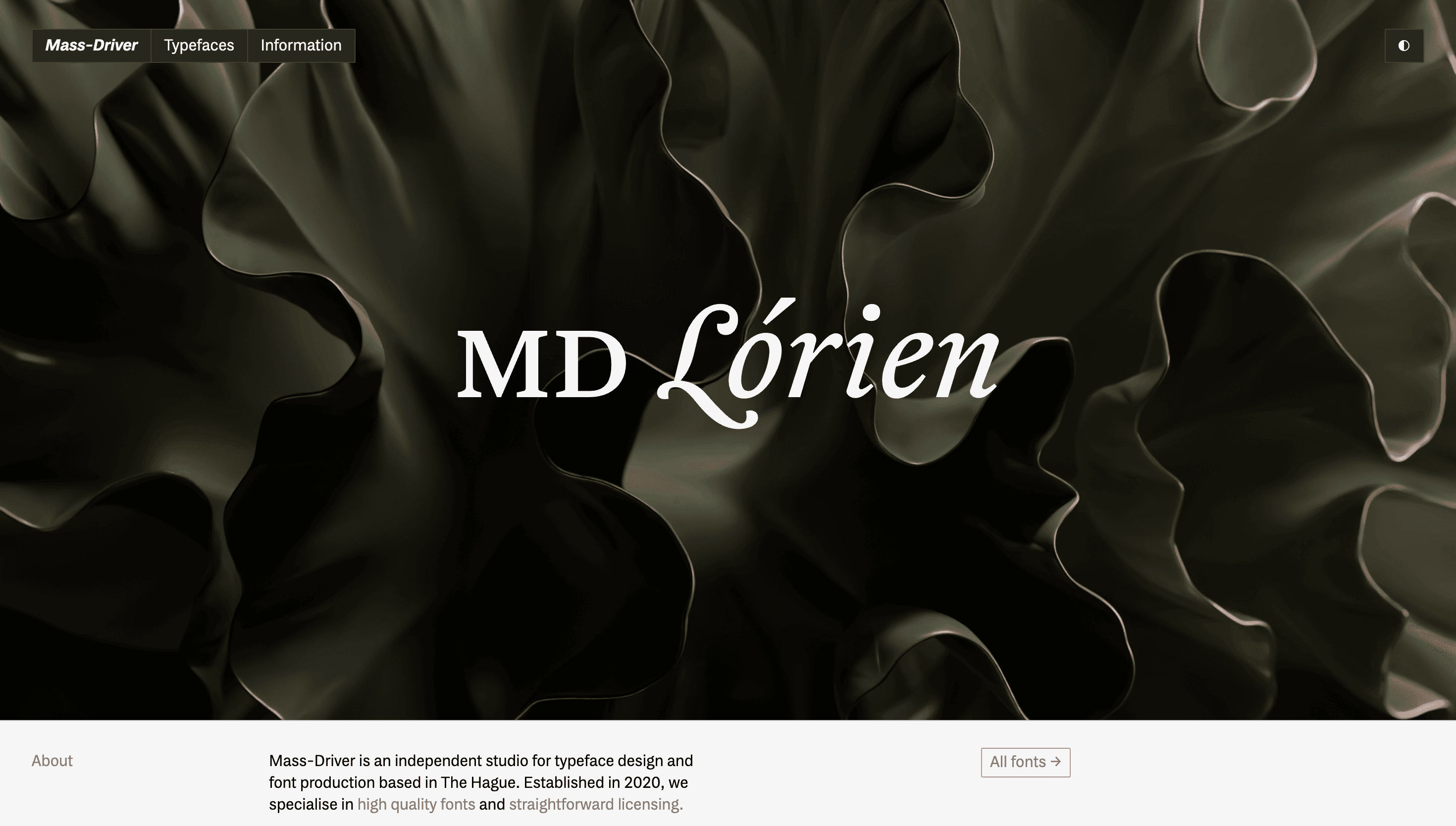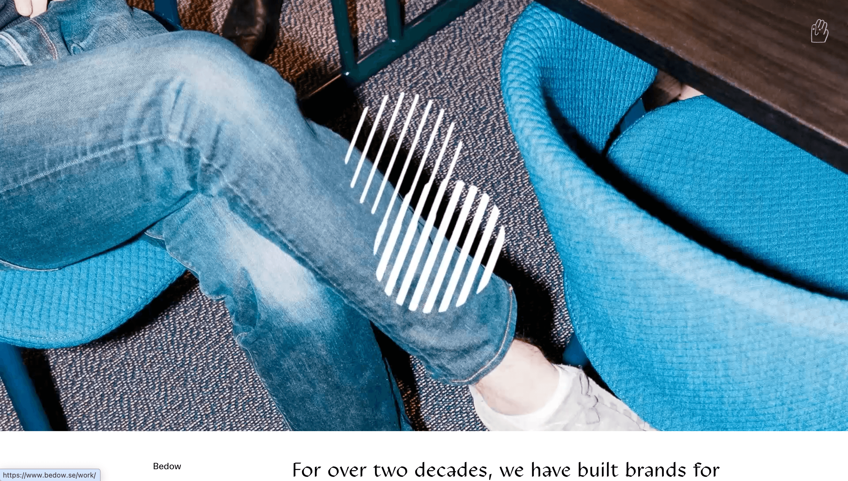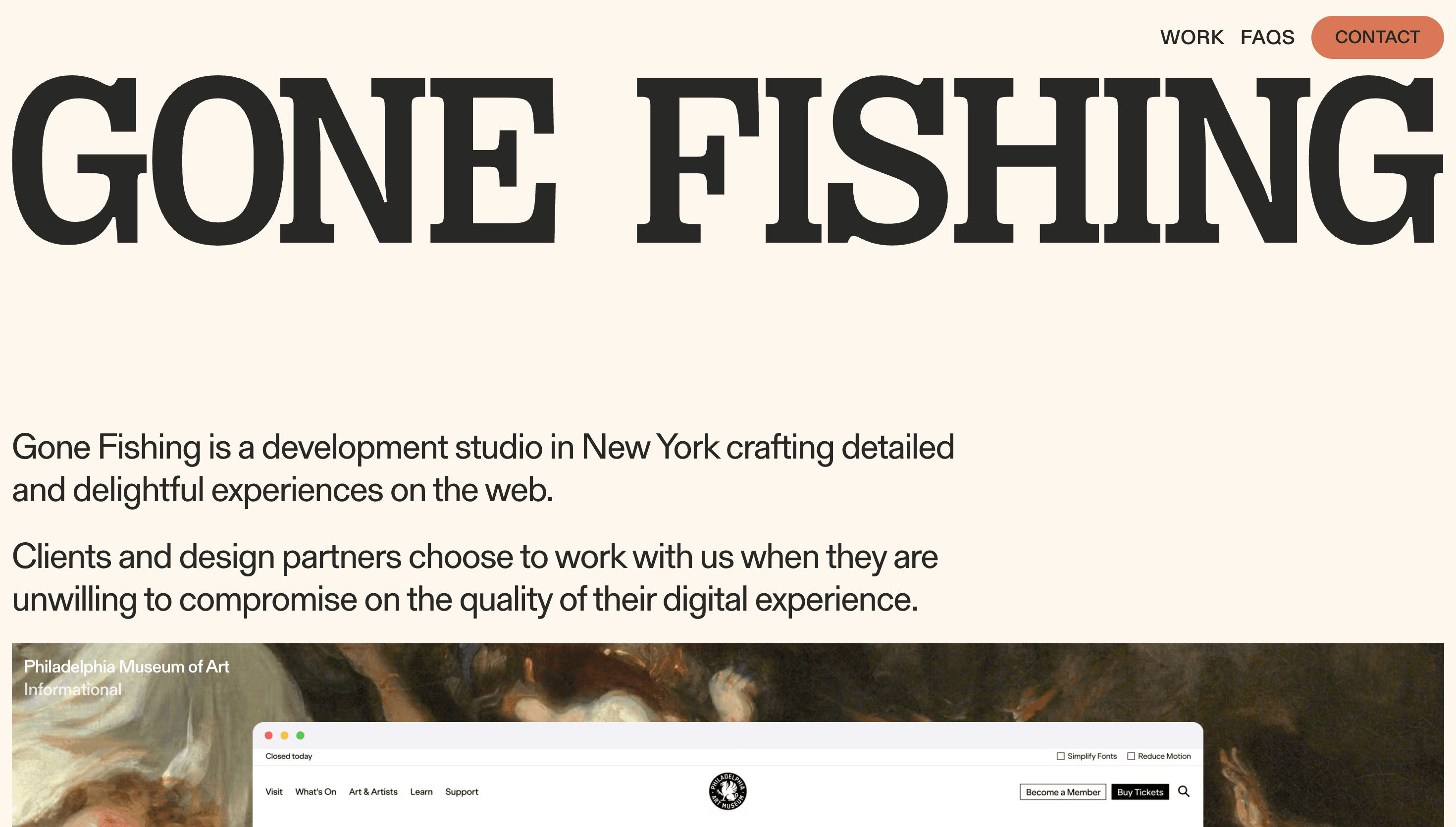
Typography Website Design
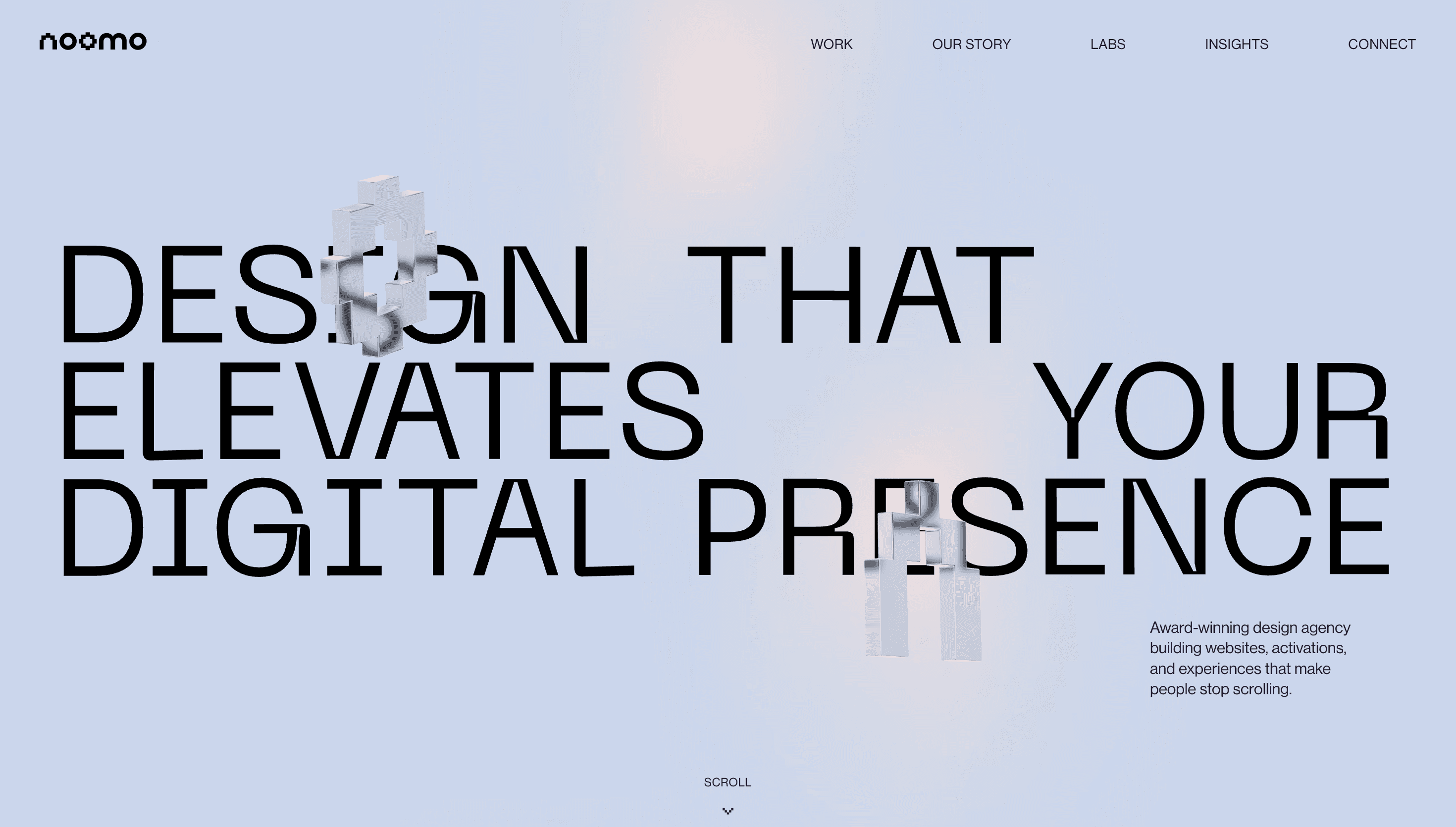
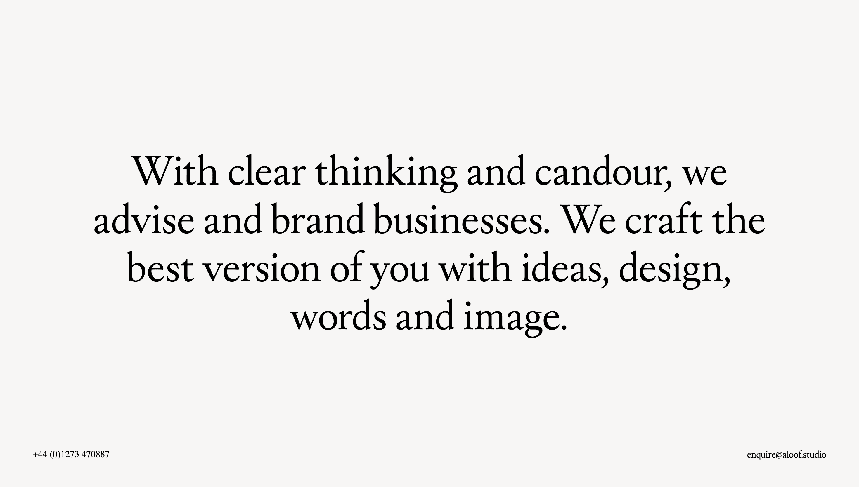
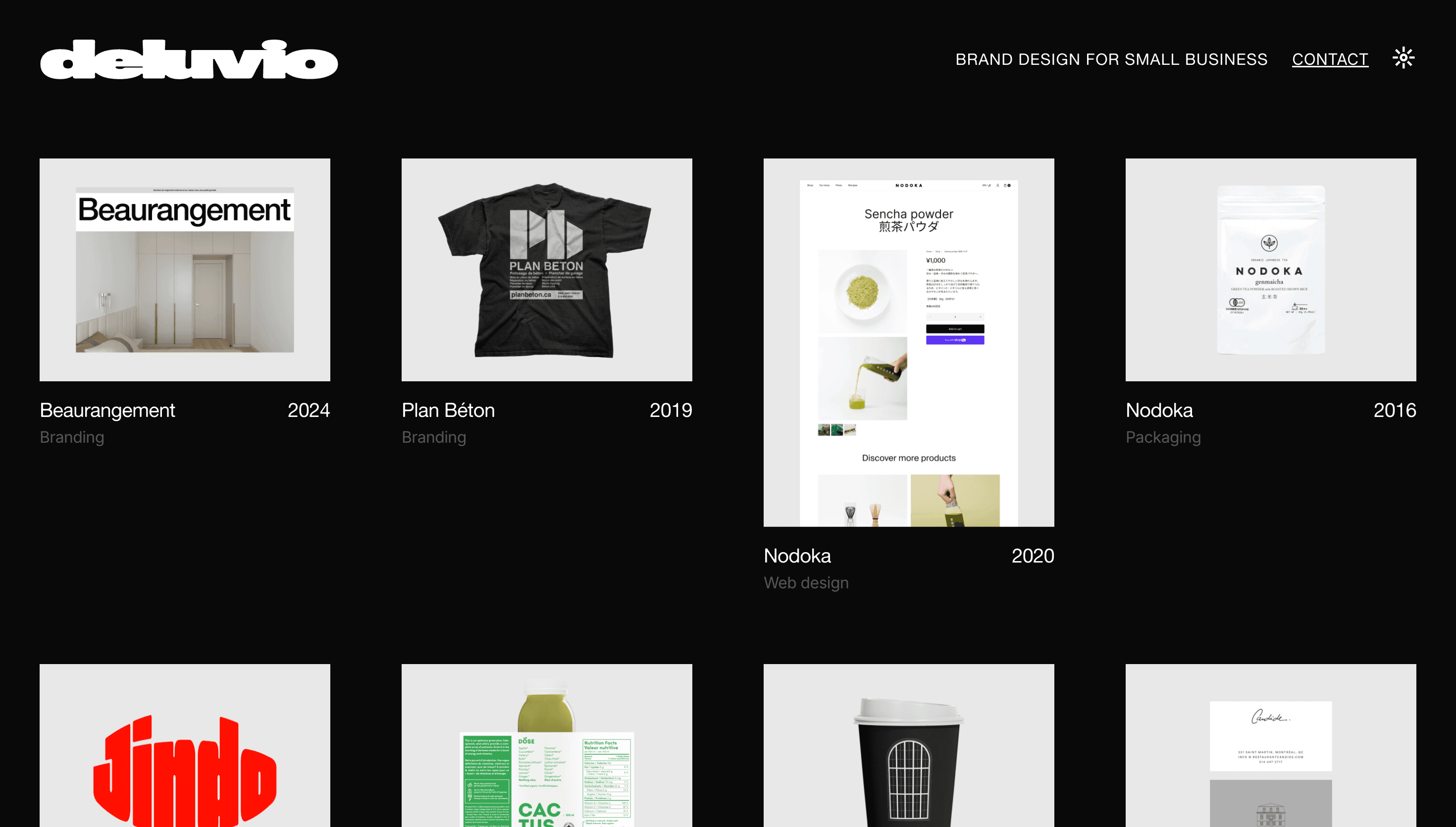
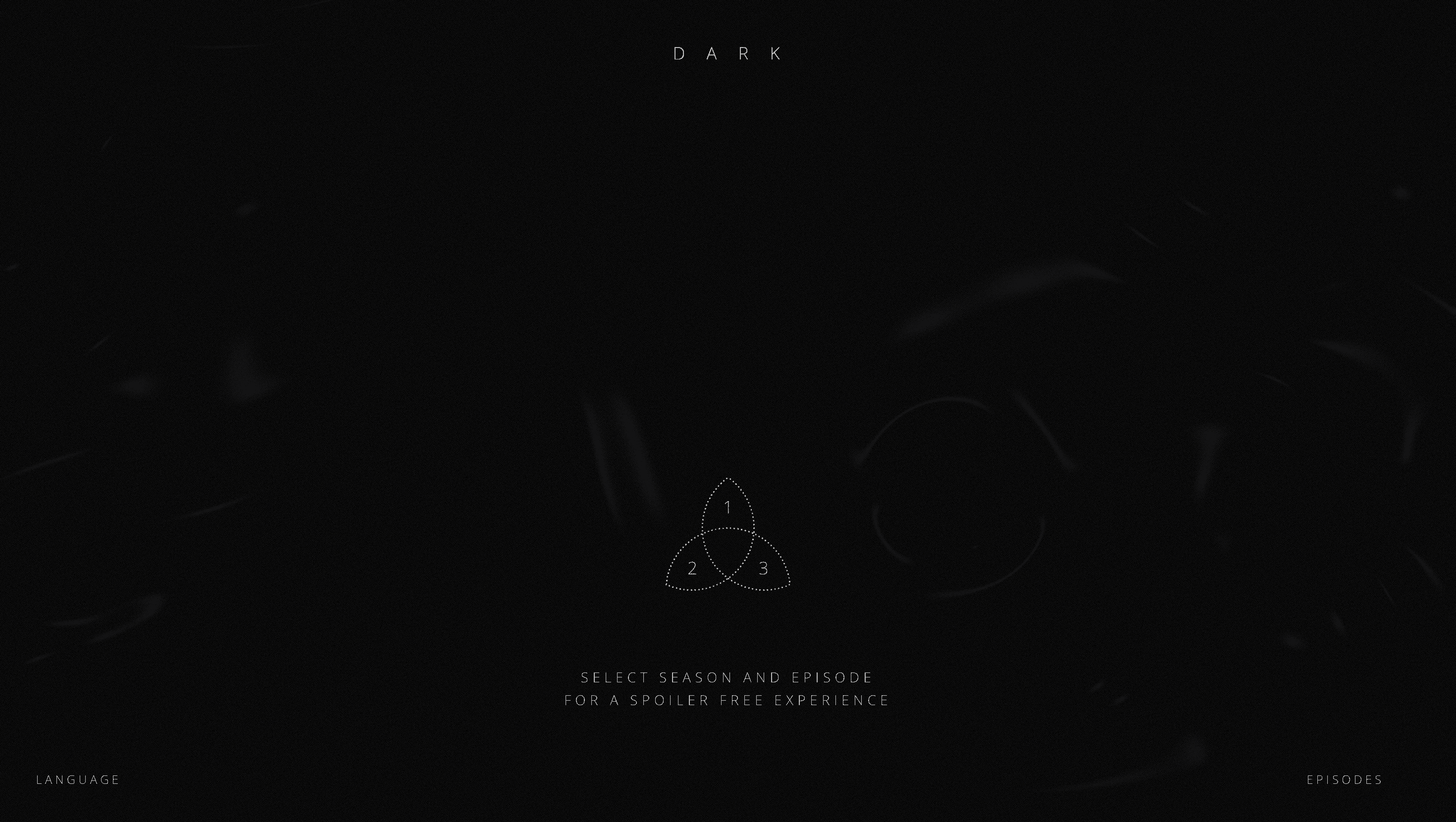
Typography-led website design turns words into a primary visual system rather than a supporting layer. This collection highlights projects where type hierarchy, scale, and rhythm define the brand experience. As you review examples, focus on how headings, body text, and microcopy work together across hero sections, navigation, and long-form content. The strongest typography websites maintain consistency while still creating contrast between editorial blocks and action-oriented UI. You will also see bold, kinetic, and brutalist references that use oversized text and unexpected spacing without breaking usability. Another useful pattern is responsive typography discipline. Great projects adjust measure, line height, and spacing for mobile so strong desktop art direction remains readable on small screens. This set is ideal when refining a design system, choosing font pairings, or redesigning content-heavy pages where clarity is essential. Use it to benchmark typographic voice, scannability, and interaction cues that depend on text rather than decorative graphics.